Quick Summary
Good digital signage design comes down to a few non-negotiables: text your audience can read from across the room, contrast that holds up in any lighting, and a layout that puts the most important message first. Keep your hierarchy to three levels, your text short, and your background clean enough that nothing fights for attention. Get those right and your screens do their job without anyone having to stop and study them.
What Makes Digital Signage Design Work
Digital signage competes with everything else in the room: phones, conversations, whatever's happening in the hallway. Your screens should work more like a billboard than a brochure. A brochure gives you everything at once and loses you in the process. A billboard earns attention with less — one message, one image, one clear takeaway.
These nine digital signage design rules cover what makes a screen readable, memorable, and worth the glance, whether you're building your first presentation or cleaning up what's already live.
Why Trust Us?
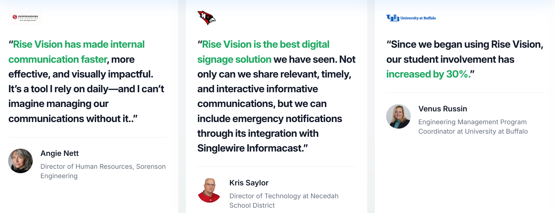
We've spent years helping schools, districts, and organizations design digital signage that works in the real world. We know what makes a display readable from across a hallway, what causes people to tune out, and where most design decisions go wrong.
The rules in this article come from that experience.
9 Digital Signage Design Rules for Screens That Hold Attention
These rules apply whether you're designing from scratch or fixing what's already on your screens. Work through them in order the first time. After that, use them as a checklist before anything goes live.
1. Color and Contrast
Color is the first element the eye registers and the last it forgets. On a digital display, it's also one of the fastest ways to lose your audience. Use the wrong palette, and no one can read your sign.
Beyond brand colors, contrast is what determines whether anyone can actually read your sign. The most avoidable mistake in digital signage design is text that blends into its background. Light text on a dark background and dark text on a light background are the two combinations that hold up at any distance and in any lighting condition.
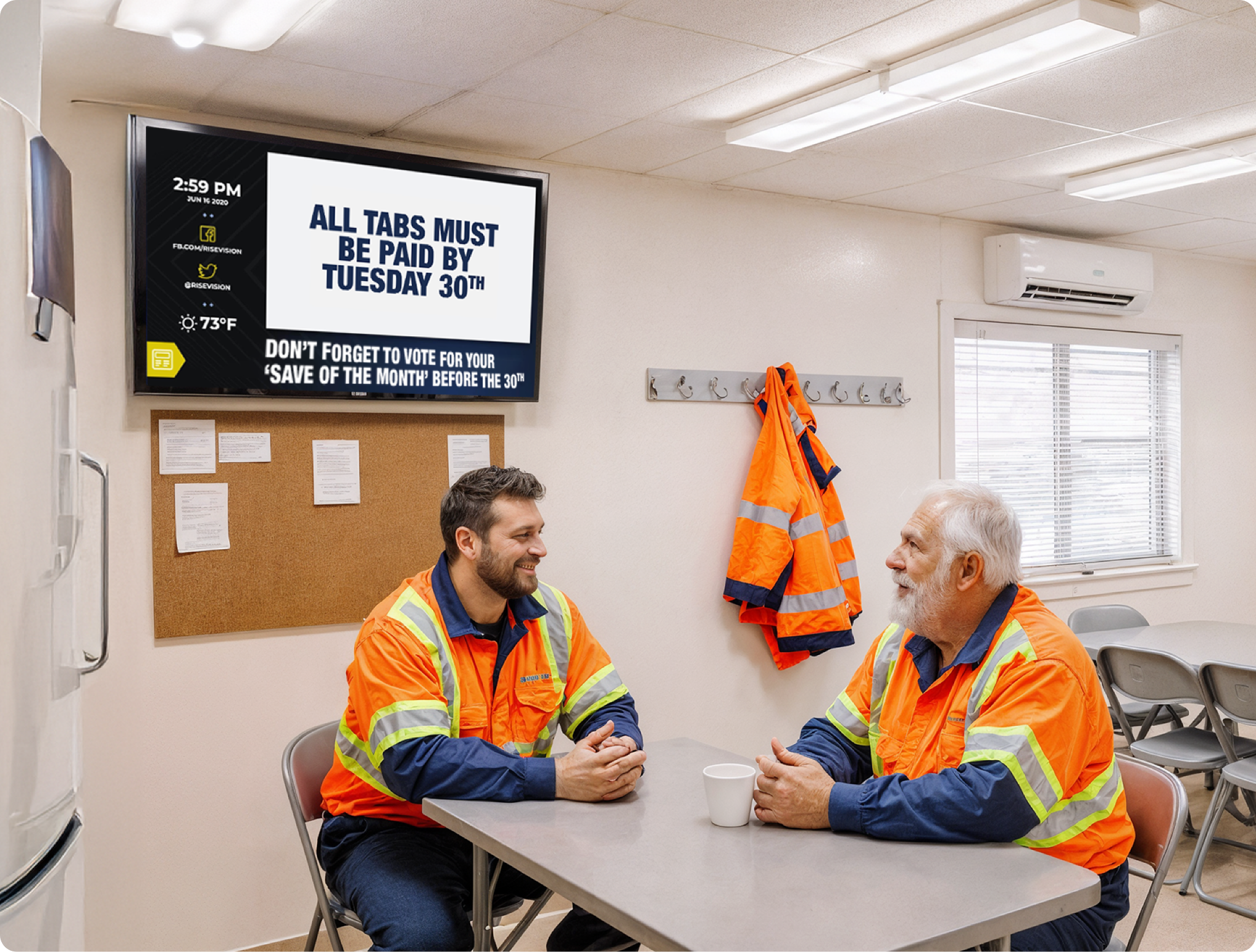
This matters particularly in schools and public spaces, where viewers aren't standing close to the screen. A student walking past a hallway display or a parent glancing at a lobby screen from across the room needs to read your message in a second or two. If the contrast isn't strong enough, the message disappears before it lands.
An effective test is to step back six feet from your design. If you have to squint to read it, increase the contrast before publishing. For a measurable standard, WCAG guidelines recommend a minimum contrast ratio of 4.5:1 for normal text and 3:1 for large text. These are the benchmarks most accessibility-conscious organizations aim for.
Also, red-green combinations are inaccessible to people with color vision deficiency, so you want to avoid that combination. If you're unsure whether your color choices hold up, Adobe Color lets you test combinations and find accessible alternatives to your brand palette.
2. Typography
If your audience has to squint, your design has already failed. Text size is the single most overlooked factor in digital signage, partly because designers are looking at the screen up close. Always design for the person at the back of the room, not the one standing in front of the screen.
When in doubt, go bolder before going bigger. A bolded font carries more visual weight and draws the eye faster than a larger font at regular weight.
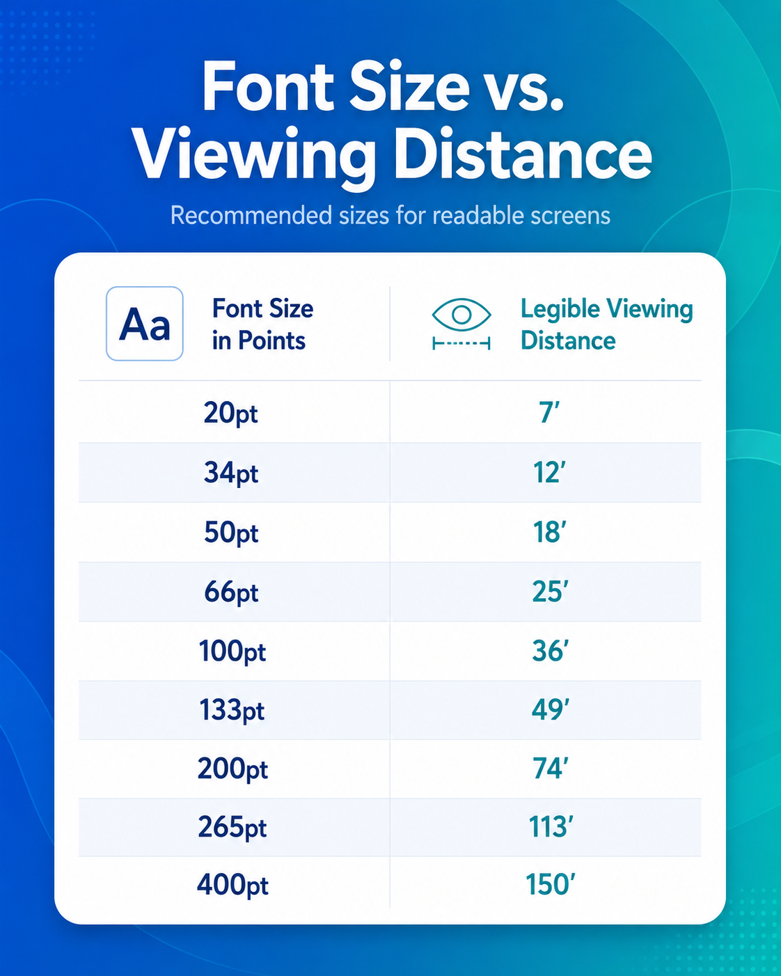
The chart below gives you a starting reference for font size against viewing distance.
If you're unsure whether a slide has too much text, apply the 3x5 Rule:
- Three lines of text with a maximum of five words per line, or
- Five lines with a maximum of three words each
It's a simple constraint that forces clarity. Digital signage isn't print and people aren't stopping to read a paragraph.
Sans-serif fonts such as Arial, Helvetica, or Verdana are generally more legible on screen than serif fonts like Times New Roman. Serifs were designed to guide the eye along lines of text in books and long-form documents. On a display — especially at distance — those small strokes can reduce legibility.
Keep to two fonts per design, and use italics sparingly since they're harder to read from across a room. You can use this tool to check compatible font pairings.
3. Timing and Dwell Time
Good design on the wrong screen at the wrong time doesn't work. A breakfast menu still running at dinner, a back-to-school message in October, or the same slide looping for weeks in a room where people sit every day. Viewers learn to ignore screens they expect to show the same content, often without realizing they're doing it, a phenomenon called display blindness.
Before publishing any content, you want to know how long someone will be in front of this screen. That's dwell time, and it should drive every decision about how much content you put on a slide and how long each slide stays up.
Dwell time varies by location:
- Passerby locations (hallways, entrances, pick-up and drop-off zones): design for roughly 30 seconds
- Mid-dwell locations (reception areas, waiting rooms, staff break areas): 30 seconds to 2 minutes
- Long-dwell locations (offices, classrooms, conference rooms): 2 to 30 minutes
A hallway display needs to land one clear message instantly. A waiting room screen can rotate through a fuller playlist. Getting this wrong is one of the most common signage mistakes: cramming too much onto a fast-moving screen, or looping a 15-second slide in a room where people sit for 20 minutes.
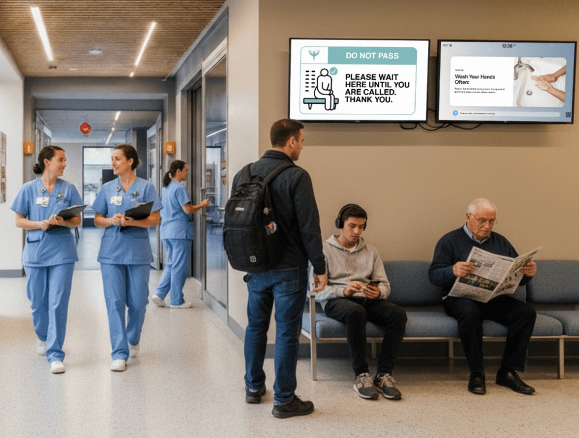
Rise Vision's scheduling tools let you assign different content playlists to different displays and set time-of-day rules, so your lobby display and your staff breakroom can run completely different content without anyone touching a screen manually.
4. Interactivity
Interactivity on a digital sign doesn't always require a touchscreen. A call to action like a QR code, a URL, or a prompt to follow your social accounts counts as interactivity. The difference between a passive sign and an interactive one is whether it gives your audience somewhere to go next.
A QR code linking to the lunch menu, a prompt to register for an upcoming event, or a simple call to action directing people to a specific room. These are all interactive moments that work on any display. The key is making the action clear and the payoff immediate. Even viewers who don't scan them register the presence of one as a signal that there's a next step.
For environments where touch interaction makes sense — lobbies, visitor kiosks — Rise Vision's interactive display features support fully touch-enabled experiences.
5. Content Hierarchy
"Content is king." — Bill Gates.
The quote holds on a digital display more than almost anywhere else. Every other rule in this guide — contrast, font size, layout, timing — exists to support your content. Get the content wrong and none of it matters. Get it right and even an imperfect design does the job.
Visual hierarchy is the order in which a viewer's eye moves through your design:
- Headline first
- Supporting graphic second
- Color and contrast drawing attention to what matters
- Secondary information last
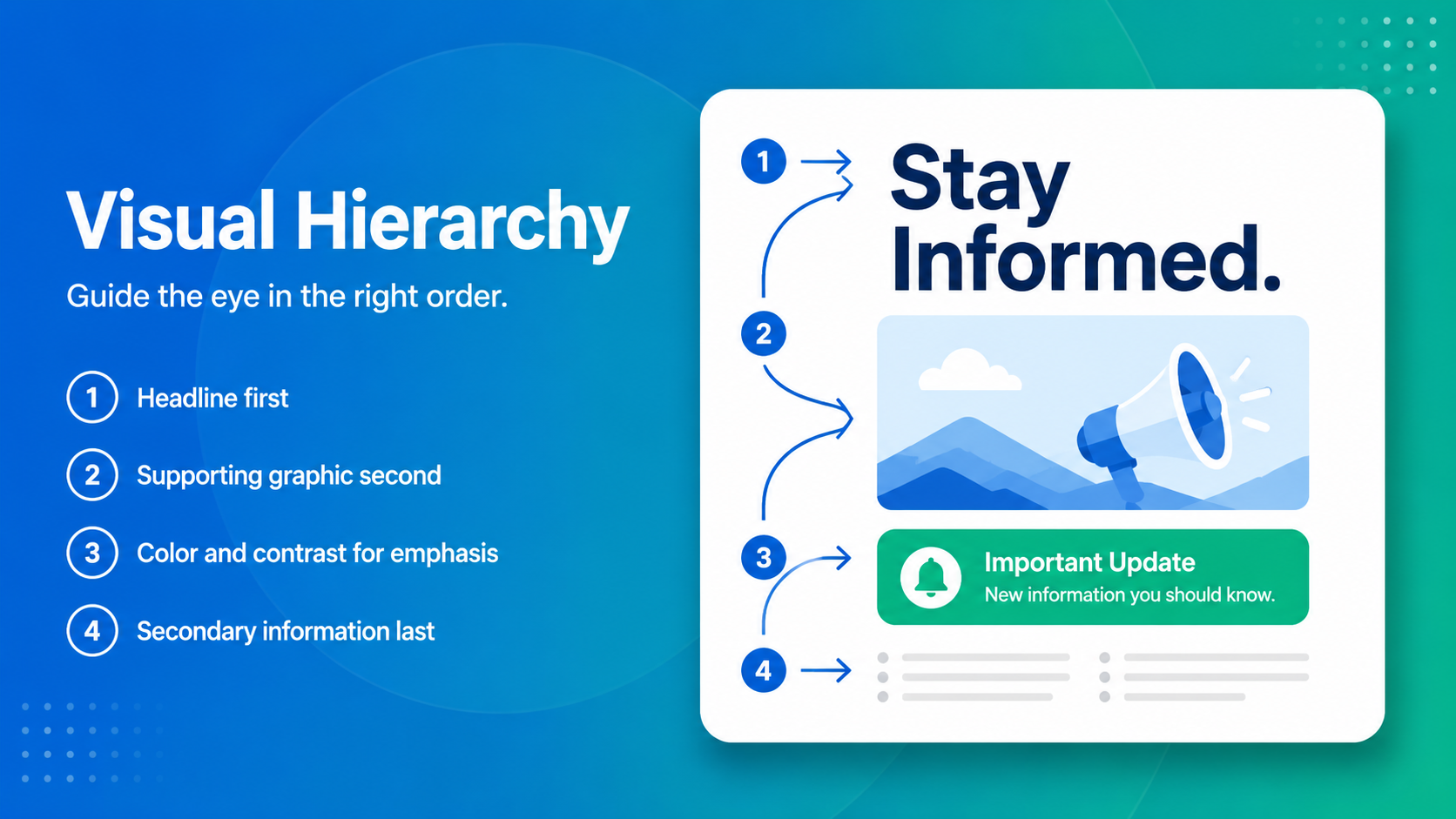
Your most important message should dominate visually. It should be bigger, bolder, and positioned where the eye lands first. Everything else supports it.
A useful test is to squint at your design — whatever you can still identify is your hierarchy doing its job. Your headline should still be obvious, your supporting image recognizable, your branding present but not competing for attention.
If you have three pieces of information, make three slides. Each one should carry one clear primary message.
The brain naturally gravitates toward things that are easy to understand and moves away from things that feel overwhelming. A cluttered slide actively pushes people away before they've read a word.
6. Layout, Zones, and Composition
How you arrange content on your screen determines whether viewers process it instantly or ignore it entirely. These three principles cover the most common layout decisions you'll make.
Leave Safe Space Around the Edges
TV screens often cut off content near the frame. Treat the outer 5% of your canvas as a buffer zone and keep text and key visuals well clear of the edges. It's the digital equivalent of a print bleed. Easy to account for, costly to ignore once content is already live on a screen.
Follow the F-Pattern
Viewers in left-to-right reading environments scan top-left first, then move across and down. Your most critical information — the headline, the key date — belongs in the top-left area of your design. Decorative elements and secondary information can occupy the rest.
Use Zones Strategically
A zoned layout divides your screen into sections that can display different content types simultaneously: a main message in the primary zone, a news ticker at the bottom, a date and time widget in the corner.
Rise Vision supports multi-zone templates that let you divide your screen into sections, each displaying different content simultaneously. A good rule of thumb is to keep video to a single zone so two clips never compete for attention at the same time.
7. Screen Ratios, Resolution, and File Size
The technical side of design often gets skipped. But it has a direct impact on how professional your content looks in the real world.
Aspect Ratio
Standard digital signage screens run at 16:9 for landscape orientation and 9:16 for vertical (portrait) installations. Design your content in the correct ratio from the start. Content stretched to fit a screen always looks off, and it signals poor production quality before anyone reads a word.
Resolution
Full HD (1920x1080 pixels) is the standard for most digital signage displays. Design and export at this resolution wherever possible. Low-resolution assets look blurry on modern screens, especially anything 4K-ready. As a reference:
- 960 x 540 pixels — quarter HD
- 1280 x 720 pixels — standard HD
- 1920 x 1080 pixels — full HD (recommended)
- 3840 x 2160 pixels — ultra HD / 4K
File Size
For images, 2-3 MB per file is the practical sweet spot. That's high enough quality to look sharp, and small enough to load reliably over slower or congested Wi-Fi. Very large files can cause displays to stall or lag, particularly in schools where network bandwidth is shared across many devices.
Rise Vision's template library and AI design tool are built to these specifications by default. If you're uploading your own assets, exporting at 1920x1080 and keeping file sizes in check will save troubleshooting time later.
8. Image Overlays
If you're placing text over a background image, add a semi-transparent dark overlay between the image and the text. Without it, even bold text can disappear into a busy background, especially on a screen with high ambient light or at viewing distance.
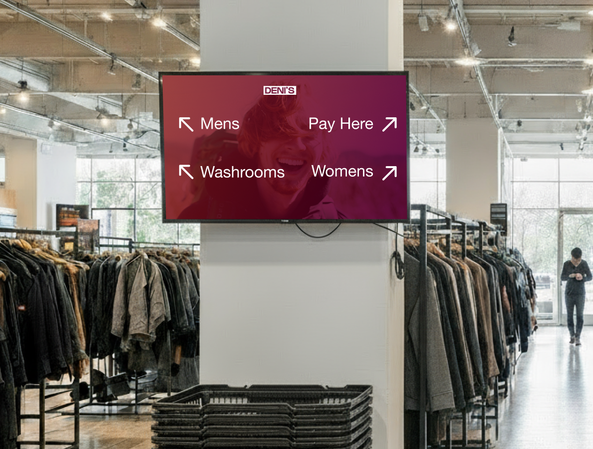
White text over a dark overlay is one of the most reliable combinations for signage. If your background is already dark, a subtle overlay is usually enough. If it's bright or visually busy, increase the opacity until the text is clearly legible from the back of the room.
If you're building your own layout in Canva, draw a rectangle over the area where your text will sit. Set the fill to a gradient, make one end match your background color (use the eyedropper on the image) and the other end fully transparent. Duplicate it, flip it vertically, and place one at the top and one at the bottom. This lifts the contrast around your text without covering the image behind it.
9. Sound: When to Use It
Not every screen should play audio. Before adding sound to any digital signage content, ask two questions:
- Is this environment appropriate for audio?
- Is it actually audible?
Sound works well in controlled settings like a lobby with limited foot traffic, a dedicated presentation screen, or an event space. It generally doesn't work in open hallways, classrooms during lessons, or shared office areas where audio creates noise rather than communication.
If your content includes video and sound is appropriate, make sure the volume is audible but not jarring. Where the environment is mixed, subtitles or captions are a reliable fallback. Most viewers will read them even when they can't hear the audio.
Design Smarter with Rise Vision
These design principles work best when your platform makes them easy to apply. Rise Vision gives you 750+ professionally designed templates built to the right ratios and resolutions, an AI design and editing tool that handles contrast and layout automatically, and multi-zone scheduling so your screens stay current without manual updates.
You can start with a free 14-day trial. If you subscribe and it's not the right fit, you're covered by a 30-day money-back guarantee.
More From Our Blog
-
Digital Signage Remote Management: How to Run Every Screen From One Place
Digital signage remote management lets you control screens, schedules, and display health from an online platform. To get started, choose a hardware-agnostic platform, connect your media players or[…]
Read More -
ScreenBeam Review 2026: Features, Pricing, and Limitations
ScreenBeam sells wireless display receivers that let people cast to a screen from any device without an app. You need one receiver per display, and they run from $299.99 to $1,199.99. Cloud-based[…]
Read More -
Interactive Touch Screen Digital Signage: How It Works and What You Need
Interactive touch screen digital signage lets viewers tap a display to find what they need. It pairs a commercial touch display with content software. Common uses include wayfinding, visitor[…]
Read More
12,300+ Organizations Trust Rise Vision, You Can Too
































Schedule a Free Demo
You deserve the #1 all-in-one platform for digital signage, screen sharing, and emergency alerts.