
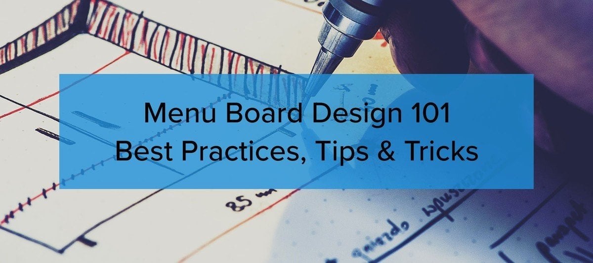
Digital menu boards are quickly becoming a popular choice for restaurants, cafes, bars, and cafeterias when it’s time to decide on a behind-the-counter, wall-mounted menu. Not only do they make customers feel like they’re dealing with a 21st Century Business, but the staff also enjoys the fact that pricing, menu items, and even the menu board design can be quickly updated with ease. And best of all - they’re bright and easy to read!
In this post, we’re going to discuss digital menu board design in detail. However, some of the tips will also apply to non-digital menu boards as well. We’re going to go over do’s-and-dont’s, best practices, color theory, Rise Vision features, and pre-made templates that you can jump right in and start using. Without further ado and in no particular order, here we go!
1. Use the largest text size possible.

We can all learn from In-N-Out Burger even though they haven’t gone digital. Big, clear text always works! (Image Source)
Believe it or not, if you’re designing your first menu board, you’re naturally going to struggle - even battle with yourself - over how much information to put on your menu board. You may offer a lot of items. And of course, the more you offer, the faster you’re going to run out of room. One solution is to decrease your text size and voilà! - everything fits!
However, if you take 20 paces away from your board - you won’t be able to read anything. This is where the battle begins. You’re guiding rule here is: always make your text size as large as possible. You may need to iterate on your menu board design a few times before you get it right. Here are a few tips that may help you during this process:
- Reduce information. Keep descriptions short and concise. Less is always more on a menu board.
- Try different fonts. Adjusting fonts can increase space and improve readability.
- Add a display. Sometimes you just need more displays to cover your complete menu.
Keep re-editing your menu information and adjusting your text size until you have a clear and easy to read menu that can be read from almost anywhere in your establishment.
2. Use easy to read fonts. Don’t get fancy.
Like we said in the last section, choosing the right font can make or break your design. For instance, it can be tempting to try to use fonts that portray a rustic or artisanal look:

But..they can be very difficult for your patrons to read. And remember, you as the designer know what your menu says. It will read as clear as day to you. But for first-time viewers, it could look like hieroglyphics!

With that said, here are are a few fonts that are always easy to read:
- Arial
- Helvetica
- Veranda
- Trebuchet
- Merriweather
You may have a brand style guide that outlines the fonts and typography deemed suitable for use by your organization. Refer to that style guide when designing your menu board. This issue may have already been solved long ago!
3. What colors should you use on a menu board?
The single most important aspect of choosing colors is that the color palette you use should match your organization’s branding. Again, many businesses, schools, and organizations will have a style guide that will have a prescribed color palette.
If you’ve never seen one come across your desk, ask around and chances are a style guide was created at some point in time. Refer to the style guide for your menu board design color choices.
If you’re a Rise Vision customer, some of our templates will auto-adjust colors based on your color palette. Simply enter your primary and secondary colors and you’re ready to rock!
If you don’t have a style guide, it’s usually a safe bet to choose a complementary color palette:

Complementary colors are a safe choice when designing menus. The high contrast between colors make reading the menu easy and clear. (Image Source)
4. Lose the motion
It can be fun to design digital menus that swipe, jiggle, animate, etc. However, for the people that actually need to read the menu, it can be a nightmare. When someone is trying to decide what to order and in the middle of their decision-making process, the screen moves and the information is no longer present - it becomes very frustrating.
Not only is it frustrating to the customer, but it will also be frustrating to your bottom line! Yes! The longer it takes people to order, the slower you’re making money. More customers will walk out who don’t want to wait and more customers will make the decision that they won’t come back. When in doubt, keep it simple.
5. Pictures or No Pictures?

That Arepa Beef looks yummy! (Image Source)
Pictures of your food and beverage items can help you push your more profitable items. But it does come at a cost. And that cost is real estate.
If you have certain specials or money makers, it can be smart to give those items extra attention. However, if it causes your menu to become extra cluttered, making the rest of the decision making process more difficult, you may run into some of the same problems discussed above.
So what do you do?
Answer: Test.
Now, this will be a bit of a science experiment. Ideally, you want to pick a good month where your business is pretty consistent. Avoid months with holidays or large seasonal changes.
Pick a two week time to test your new menu. After the two weeks are up, create a report and determine:
- Did sales increase?
- What were the most popular items ordered?
- Did profits increase?
- What items contributed to the most profits?
- Did the new sign design seem to help create profits?
Finally, the quality of your pictures and food photos will also have an effect. If the photos are of poor quality and make people uninterested in those items, then adding pictures or photos can be a detractor. Sounds obvious, but we’ve seen it! So, if your test menu performed worse than your original, but the photos weren’t stellar, try another test with better photos ;).
6. Too many menu choices can lead to no choices at all

Next! (Image Source)
This can be a real headache for many restaurant owners. Do you offer everything under the sun? Or do you provide a very limited selection?
On one hand, if you offer, say 50+ menu items, chances are your restaurant won’t be amazing at making all of those items. You’ll be offering a lot of mediocrity. Even worse, customers may just skip your joint and try the next place. On the other hand, depending on your clientele - they may love your restaurant and eat there almost every day, so you don’t want them getting bored with your fare.
Now, when it comes to menu design, less is more. Customers and patrons will make decisions quicker, there will be less friction at the counter, lines will move faster, employees and patrons will be happy. You also be able to focus on making each item spectacular. With that said, we highly suggest that you consider reducing the amount of items you offer.
An interesting study was conducted right outside an upscale grocery store in Menlo Park, California several years ago. The study offered different samples of jam to shoppers and during the test when there were more jam samples offered, sales decreased.
We’re not telling you to ax half your menu today. Just consider this a menu design best practice. Again, as always, run a test. It may improve your business substantially!
7. Should every menu item price end in .99?

Some establishments have taken the .99 approach to a whole new level. (Image Source)
There’s a reason why .99 is such a popular menu “trick”. But does it still work?
The theory goes that since we read from left to right, consumers will see the first digit and ignore the .99 portion of the price. However, we think it’s safe to say that a majority of people just round up to the nearest whole number when tallying their meal price. And with most restaurant sales being done with credit cards these days, consumers aren’t worried if they have enough cash on hand anyway.
We like to argue that dropping the decimals is a good way to gain menu board real estate. From a design perspective, it just looks a lot cleaner. However, you may have pricing data that suggests that .99 improves sales and profits. And as always, you can test!
8. Should you use dots or lines to visually connect items to prices?

The tracking lines on the right make it easy for the customer’s eye to track the menu item to the price. (Image Source)
If there’s a lot of information on your menu, then dots and lines can help the customers’ eye track down pricing better. However, if you just have a few menu items, then dots and lines aren’t necessary.
Some sneaky restaurateurs prefer a confusing menu board because customers will mistakenly pick higher-priced items when it’s not easy to determine which price corresponds to which item.

Alternatively, you can use this block-grid system which also helps with menu item-to-price eye tracking. (Image Source)
9. How bright should your menu board be?

It’s important that your display matches the ambiance of the room it’s in. If you’re trying to provide a low energy, more relaxing environment (take a wine bar for example), you’ll probably want to turn down the brightness. If your menu is outdoors, them you want your menu adjusted to the brightest setting possible.
One disadvantage of running your display at the brightest setting possible is it will draw more power and run up your electric bill. A creative way to use less power is to use white text on a black background. In this scenario, the menu can be adjusted to maximum brightness and still save power.

10. How often should you update your menu board?
Updating your menu board can cause confusion for you current customers. If items or sections move around, they may get frustrated if they can no longer easily find them.
The only reason to update your menu board should be for:
- Reflect new pricing.
- To test a new design against an older one.
You might get a wild stroke of creativity in the middle of the night, leading you to want to redesign your menu. Unfortunately, this can be a very dangerous move that can destroy sales and more importantly profits.
11. Do you want your menu board to be purposely confusing to increase sales?
Huh?
Yep. Sounds crazy, but hear us out.
One great way to upsell customers is to get them to ask questions. A great cashier that’s been trained to nudge and upsell on the spot can really increase average order value.
So how do you pull that off?
The trick is to not make your menu annoyingly confusing. The goal is to make it subtly confusing where customers will naturally ask questions that can lead to upsells.
For example, have a section called “ask for a combo!”. Use a large photograph of a great looking combo meal. In this case, the call-to-action doesn’t list what’s in a combo, which leads customers to ask the cashier for more information and the potential for an upsell can occur. Generally, combination meals increase the average order value.
12. Should your menu board play audio?
Should your digital menu play sounds or music?
It can be a nice touch to have your menu play soothing music or even have a narration welcoming people to your establishment every few minutes.
Audio is a secret marketing trick. Why? Because you can’t “unhear” something. With a menu, eyeballs can dart around all over the place avoiding your most profitable items and combos. However, if a narrator announces, “How does a big juicy cheeseburger combo meal sound right about now?”, well that will surely get your customers’ attention.
Not all digital menu boards have the capability of playing audio. You will need displays that have built-in speakers and digital signage software that supports audio.
13. How many displays should your menu consist of?

The five display arrangement shown above certainly does a great job. (Image Source)
This is a great question.
Obviously, having more displays costs more money. But this is one of those instances where it’s wise to not be pound foolish.
Remember when we discussed “menu real estate”?
You want to design a digital menu that’s easy for your customers to read and understand. One of the best ways to do that is to make sure you have enough screen area to accommodate your entire menu.
Ask your display provider if they allow for returns. That way, while you’re designing and testing your menu, if you end up not needing that extra screen - you can always return it.
Conclusion
A great menu board is a crucial component to a great customer experience at your establishment. Below we boil down the important points from this article:
- Keep it simple. Don’t suffocate people with info and text.
- Focus on the stuff that’s most important.
- Use color and fonts that are high contrast. So you can see them from a far distance.
- Focus on readability.
- Focus on clarity.
- Use the largest text size possible.
- Use easy to read fonts.
- Use colors specified by your organization style guide.
- Don’t use motion or animation.
- Pictures can certainly help sell!
- Too many menu choices can lead to no choices at all.
- Test pricing, decimal choices, item count and designs.
- Dots and lines can help customers track pricing easier.
- Screen brightness depends on whether your display is indoor or outdoor and the ambiance or setting you’re looking for.
- Consider designing a board to get customers to ask questions.
- If done right, audio can do wonders.
- Always get more displays because chances are you can return the ones you don’t need.
Digital Menu Board Templates You Can Use
Rise Vision is a digital signage content management system. Sign up for our service and download restaurant and school cafeteria menu board templates.
You can view some of our templates here:
More From Our Blog
-
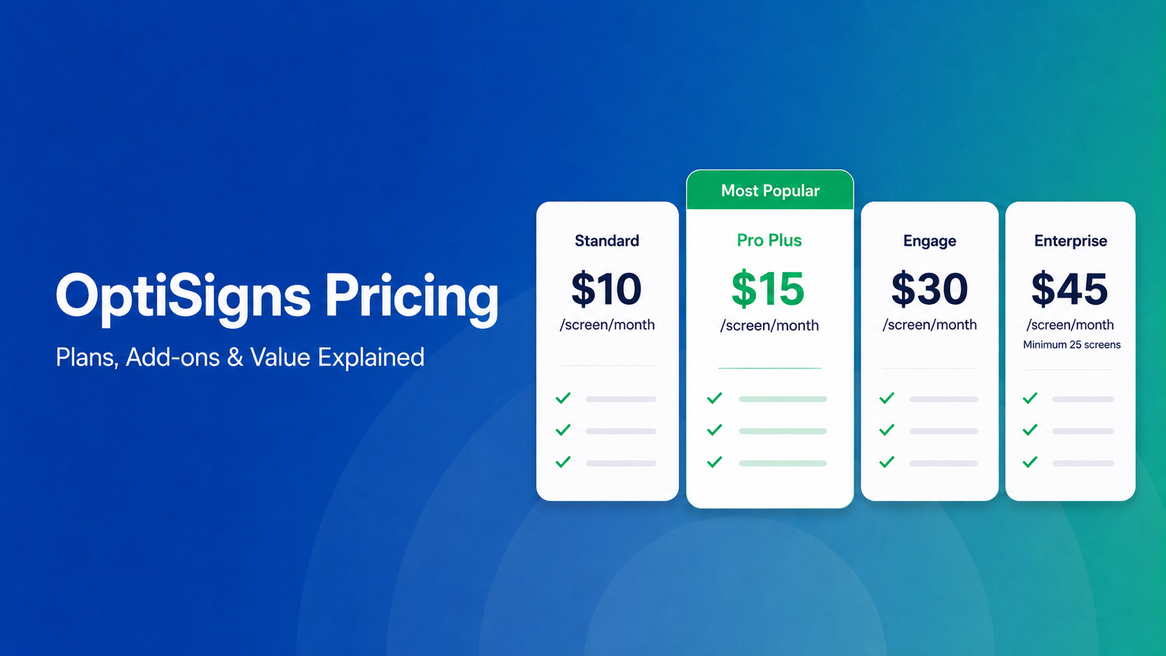
OptiSigns Pricing in 2026: Plans, Add-Ons, and What It Really Costs
OptiSigns' paid plans run $10–$45/screen/month ($9–$40.50 on annual billing). Add-ons for wireless presentation and video walls aren't included in any base plan, and phone support requires an upgrade[…]
Read More -
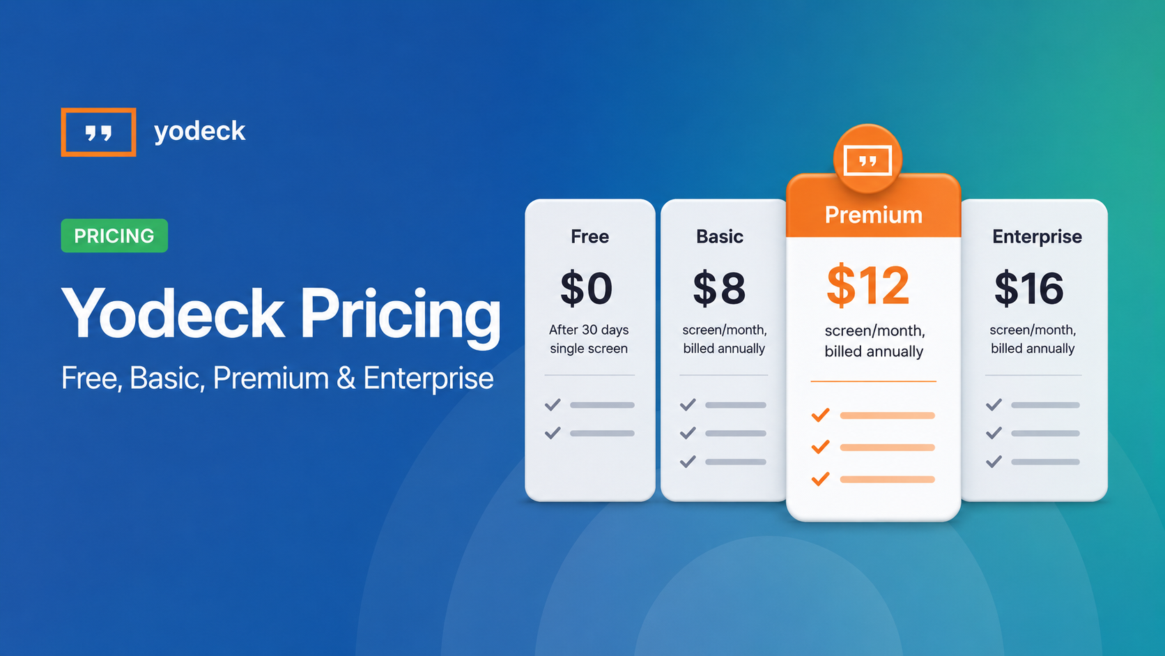
Yodeck Pricing: Plans, Costs & What Changed in 2026
Yodeck bills per-screen with no ceiling (free up to $16/screen/mo) so costs rise with every display added. 2026 Price Increase: Yodeck raised Premium and Enterprise plans by $1/month per screen,[…]
Read More -
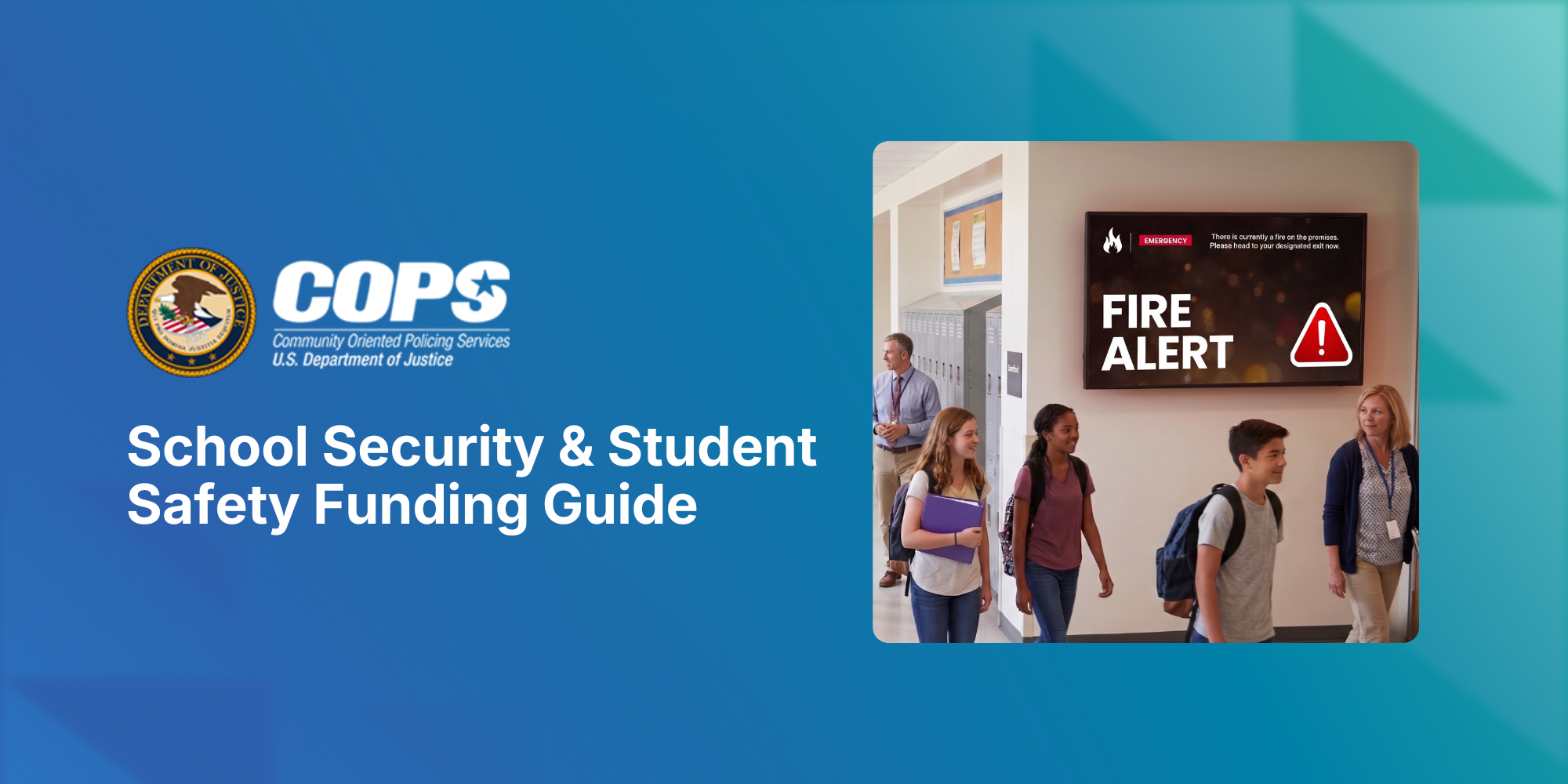
The COPS School Violence Prevention Program: A K-12 District's Guide to Federal Funding to Support Student Safety
Every year, school districts are asked to do more with less: keep students safe, keep communication clear, and keep budgets in check, often all at once. The School Violence Prevention Program (SVPP)[…]
Read More
12,300+ Organizations Trust Rise Vision, You Can Too


Schedule a Free Demo
You deserve the #1 all-in-one platform for digital signage, screen sharing, and emergency alerts.


