
Quick Summary
Effective digital signage starts with legible design, accessible contrast, and content that matches your viewing environment. Keep screens current with a content plan, make updates simple enough for any staff member, and build the habit of testing and improving over time.
Looking to Get More Out of Your Digital Signage?
A successful digital signage strategy rests on three critical pillars: design, operations, and technology.
If you excel at content but ignore network management, your screens will bottleneck your IT team. If your deployment is technically flawless but your visuals are cluttered, your audience will walk right past them.
To get a return on your investment, you have to master the entire ecosystem. This comprehensive guide breaks down the overarching best practices across all three pillars.
Why Trust Us?
We know that an effective digital signage network has to be sustainable. If a guide tells you to make gorgeous content but it requires 40 hours of manual labor a week, it's useless. We approach best practices through the lens of maximizing your Total Cost of Ownership (TCO), giving you scalable content workflows and automated systems that don't drain your staff.
10 Digital Signage Best Practices for Content That Gets Noticed
1. Make it Legible
Legible copy makes it easy for your viewers to see and understand your message at a glance, and from a distance. Typically, your viewers will mostly be taking in your signage from at least 5–10 feet away. Design with that distance in mind.
Here are a few rules of thumb when it comes to styling the text on your digital signage.
Large Font Sizes Are Best
Make sure your text is legible from a distance. Here’s a good example:
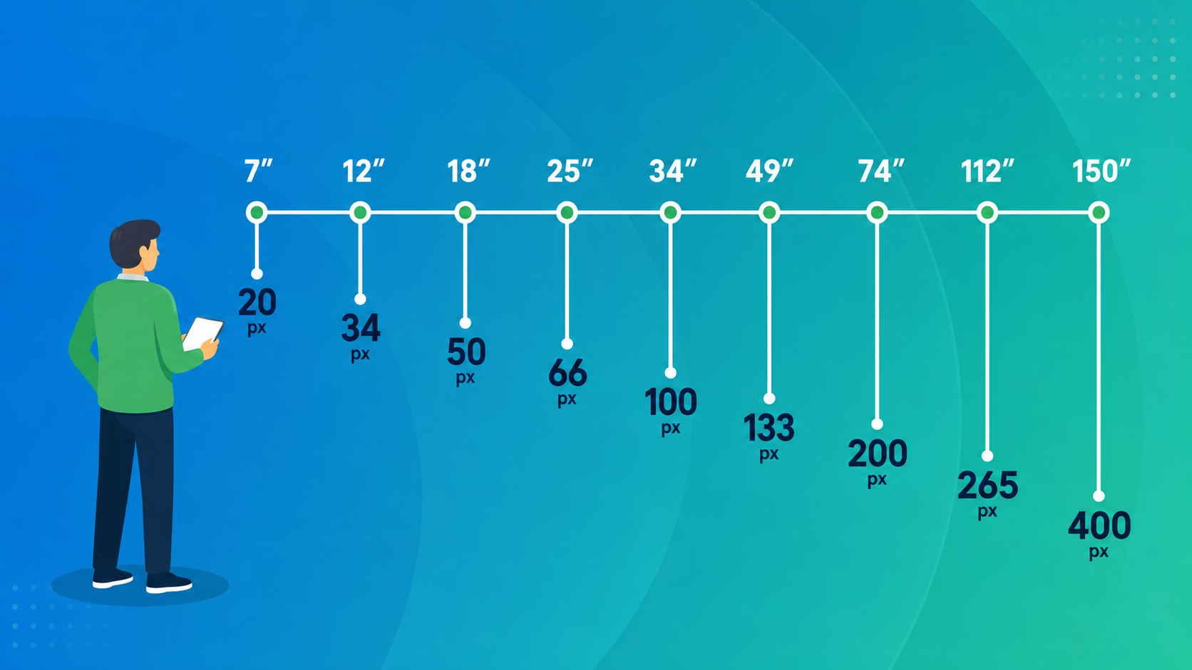
 The ideal font size will vary depending on how far your viewer is from the screen. In lobbies and offices, the viewer is usually positioned within 5 to 10 feet from your sign. In restaurants and data centers, the viewer can be up to 30 feet away. Use the following table to pick the ideal font size for your viewing relationship:
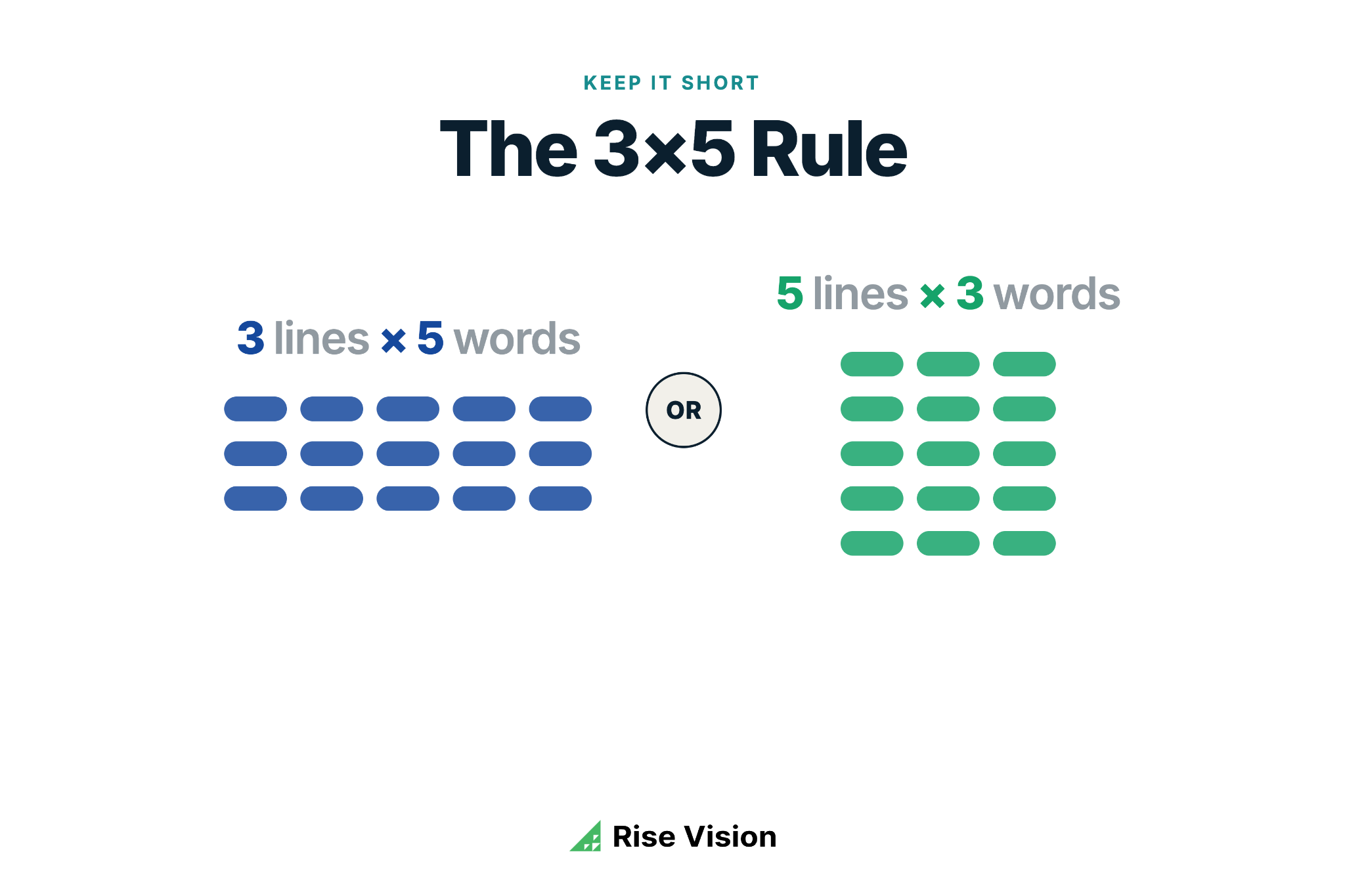
Keep it Short
Follow the 3x5 Rule. Limit the amount of text on your display to three lines of text, each with five words or fewer. OR, five lines of text with three words or fewer.
Use Sans-Serif Fonts
Use serif fonts for long paragraphs, but be wary of long paragraphs on your digital signage. Ideally, keep to bold Sans-Serif fonts as these are the easiest to read at a glance.
Other great font choices for digital signage design:
- Helvetica
- Arial
- Verdana
- Open Sans
Two Fonts or Fewer
Use two fonts or fewer in your designs. The more fonts you include, the more contrast you're creating, which can make your design appear busy and difficult to read.
Italicize Sparingly
Italicized text is harder to read at a glance. If you need to italicize, do it sparingly, keeping to two words or fewer.
2. Design for Accessibility
In 2010, the Department of Justice published the Americans with Disabilities Act (ADA) Standards for Accessible Design. In 2024, the DOJ updated its rules to require state and local government entities — including public schools — to meet digital accessibility standards for web content and mobile apps. It's a signal that accessibility expectations across all digital touchpoints are rising.
Under ADA, all electronic and information technology must be accessible to people with disabilities. Digital signage falls under this category, and there are some key requirements to keep in mind.
Text
Like we mentioned earlier, your text needs to be big enough for people to read from a reasonable distance. A great way to test this is to put up a temporary slide with a few different font sizes, walk back, and see which one is actually legible from down the hall.
Don't forget to double-check your color contrast before hitting publish, too. With the 2024 ADA Title II digital accessibility update, schools and public organizations are being held to higher digital accessibility standards overall. Applying those same contrast principles to your signage is good practice. This matters most for announcements, schedules, and emergency messages where readability can't be an afterthought.
The standard rule of thumb is at least a 4.5:1 contrast ratio for normal text, and 3:1 for larger text. You can easily run your designs through an online color contrast checker to be sure.
If you're using Rise Vision templates, they're already built to meet these accessibility standards right out of the box. Just keep in mind that if you swap out the background images or change the font colors, you'll want to do a quick check to make sure everything stays readable.
Interactive Guidelines
All functionality must be placed between 15 and 48 inches from the ground. That means all buttons, keypads, and interactive elements must appear within this dimension on your display.
Displays
Wall-mounted displays are an easy place to accidentally fall out of ADA compliance. Under Section 307.2, any object mounted between 27 and 80 inches above the floor can only protrude 4 inches from the wall into a circulation path. For your display, that means keeping depth at 4 inches or under. Most large-format signage displays ships at 3.5 inches. Confirm the spec before you mount.
3. Design for Your Viewing Pattern
Digital signage is typically viewed in three viewing patterns:
- Point of Transit
- Point of Wait
- Point of Sale
Knowing the viewing pattern for your display, and designing your content to complement it, can improve the success of your message.
Point of Transit
If your sign is located in a high-traffic space where people are walking from point A to point B, your signage will likely be seen at a glance. People in this scenario are usually walking between destinations and their interaction with your display will be short.
In this situation, short, concise messages shown in rotation are the most well received. This scenario is best for:
- Event announcements
- Daily reminders
- Calls to action
When designing for these messages, keep it short (five words or less) and make it big. Point of transit designs should feature large fonts against simple backgrounds to avoid detracting from the message.
Point of Wait
Point of wait interactions generally occur in lobbies, elevators, service desks, and any waiting place. As a result, viewing times tend to be longer in duration, allowing for longer messages and heavier content. This scenario is best for:
- Informative content such as directories, donor walls, calendars, and news
- Engaging content (trivia, video, spotlight stories, etc.) that may help to decrease perceived wait times
This viewing pattern is also ideal for interactive displays, as your viewer is interacting with your display for a longer period of time. Using an interactive display, you can show wayfinding maps, searchable directories, scrollable pages, or donor walls with search functionality.
Point of Sale
Signage located at the point of sale is generally viewed for longer periods of time and should help people make a buying decision. This type of signage is great for:
- A menu or special
- Store/service hours
- An in-store promotion
- Discounts or sales
- Promoting high-margin items
- Cross-selling
Design is very important for point of sale viewing patterns. If the sign is being used to increase brand awareness, the brand's colors and styles should be featured prominently. If the sign is being used to advertise new offerings, strong design will lead to better receptiveness of the intended message.
4. Less is More
Your signage should never feel like a burden to read. Stick to limited text, and try re-writing your message until it's as short and concise as it can possibly be.
Viewers decide in roughly three seconds whether to engage with a screen. If it looks cluttered, they move on. Whitespace isn't wasted space; it's what makes your message breathe.
Think of your display in layers:
- One primary message in the foreground
- Supporting context
- And background design that reinforces rather than competes
For example:

You can also test your messaging by covering everything on your screen except the headline and see if the message still lands. If you need every element visible for the message to make sense, there's probably too much on screen. Cut until the message is undeniable, then stop.
5. It's All in the Visuals
Your visuals are central to your design. They should always add to your message — never detract through complicated, unrelated images.
When designing graphics or creating video, design in a size that ideally matches (or exceeds) the resolution of your display. Content of lower resolution than your display will look highly pixelated and distorted.
Design in common aspect ratios like 4:3, 2:1, and 16:9, particularly for Rise Vision templates. This will allow you to easily repurpose your designs for other projects.
Avoid clutter. Don't fill your display with everything you can think of just because you can.
6. Perfect Your Call to Action
If you're using your display to encourage your viewers to take a specific action, ensure that your message is strong, clear, and concise. Give specifics (dates, times, and locations) and be precise.
A strong call to action on digital signage is short, specific, and impossible to miss. Tell viewers exactly what to do: "Register by Friday," "Scan to sign up," "Visit the main office for details." Avoid vague directions like "Learn more", which works in email, but not on a screen someone passes in five seconds.
QR codes on digital displays average a 14% scan rate, outperforming traditional digital ads' CTR of around 0.01%. If you use one, make it large enough to scan from at least five feet away, and pair it with a single-line instruction. A QR code with no context gets ignored.
7. Time Your Content to Match the Space
The pace of your space should drive your scheduling. Schedule your presentations to change according to the environment your display is in.
For example, in a dental office, transitions between presentations can occur less frequently as these spaces generally move at a slower pace. Viewers in this scenario want to be able to check in with the display periodically, in between activities like reading a magazine or checking email.
However, in a busy hallway, transitions should occur frequently as the viewing time is much shorter, requiring that information be delivered quickly and concisely.
8. Plan Your Content in Advance
The best digital signage programs treat screens with intention, structure, and lead time.
Without a plan, screens tend to sit on whatever slide was last uploaded. Content goes stale. Viewers stop noticing. And the person responsible ends up scrambling when something time-sensitive needs to go up.
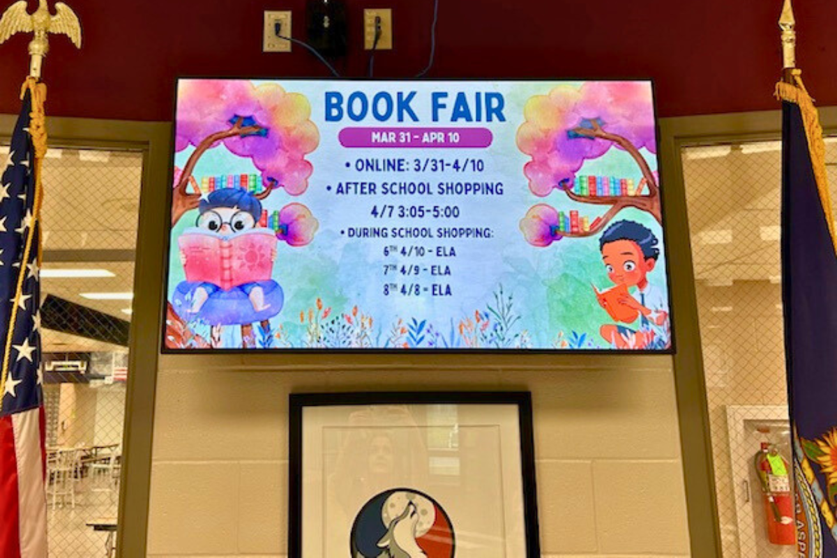
A content calendar doesn't have to be complicated. Map out your main content categories — upcoming events, announcements, safety reminders — and decide how often each rotates. Rise Vision lets you schedule content in advance, so you can load the next two weeks in one sitting and let the system handle the rest.
Weston School District in Wisconsin built their entire digital signage strategy this way, setting aside just 15 minutes at a time to plan and schedule content in their building. They didn't overhaul everything at once. They built a sustainable rhythm that keeps screens current without overwhelming the team responsible for them.
9. Make It Easy for Anyone to Update
The most common reason digital signage falls flat is stale content. And content goes stale when updating feels like a task rather than a habit.
If updating your screens requires a specific computer, an IT ticket, or a complicated workflow, it won't happen consistently. The person responsible will delay it, and screens will sit on last month's event announcement long after the event has passed. Viewers notice and they stop looking.
The fix is a platform that non-technical staff can use independently, from anywhere. When a communications coordinator can update every screen in the building from their laptop in five minutes, content actually stays current.
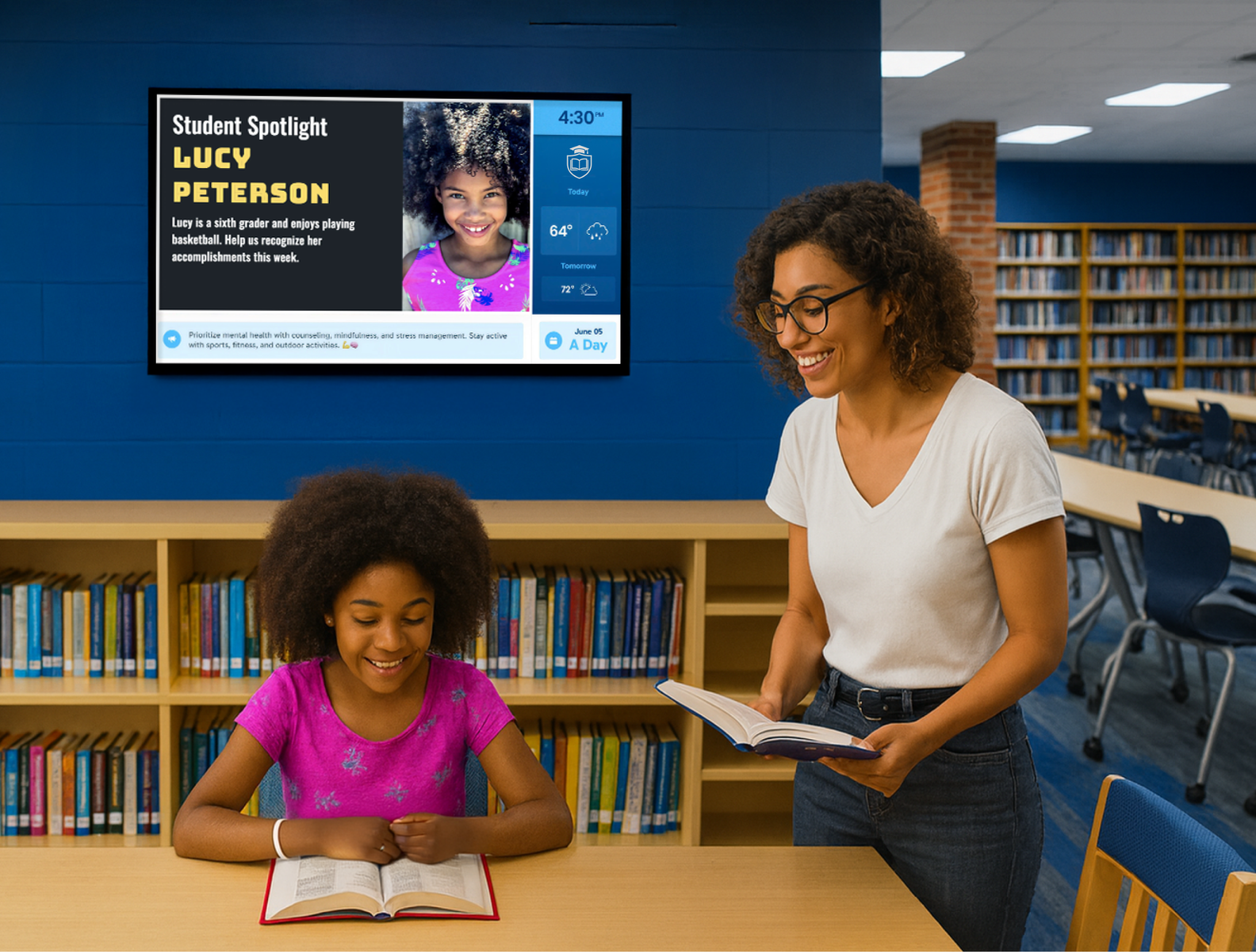
At Monticello Trails Middle School in Kansas, the communications team uses pre-built templates and auto-updating integrations to keep displays fresh without any IT involvement. Templates handle the design; the team handles the message.
10. Build, Measure, Learn
Experimenting and learning from your attempts is the best practice you can maintain when it comes to digital signage. Not sure if something will work? Test it for a day, watch what works and doesn't, and make the necessary changes for the next day. Following the build, measure, learn strategy will allow you to perfect and tailor your message to your audience and location. Constant iteration will ensure that your message is always being improved and has the biggest impact!
See These Best Practices in Action with Rise Vision
Rise Vision is built around the practices in this guide: accessible templates, simple scheduling, and a platform anyone on your team can update without IT support. Most schools are up and running in under a day.
You can start with a free 14-day trial. If you subscribe and it's not the right fit, you're covered by a 30-day money-back guarantee.
More From Our Blog
-
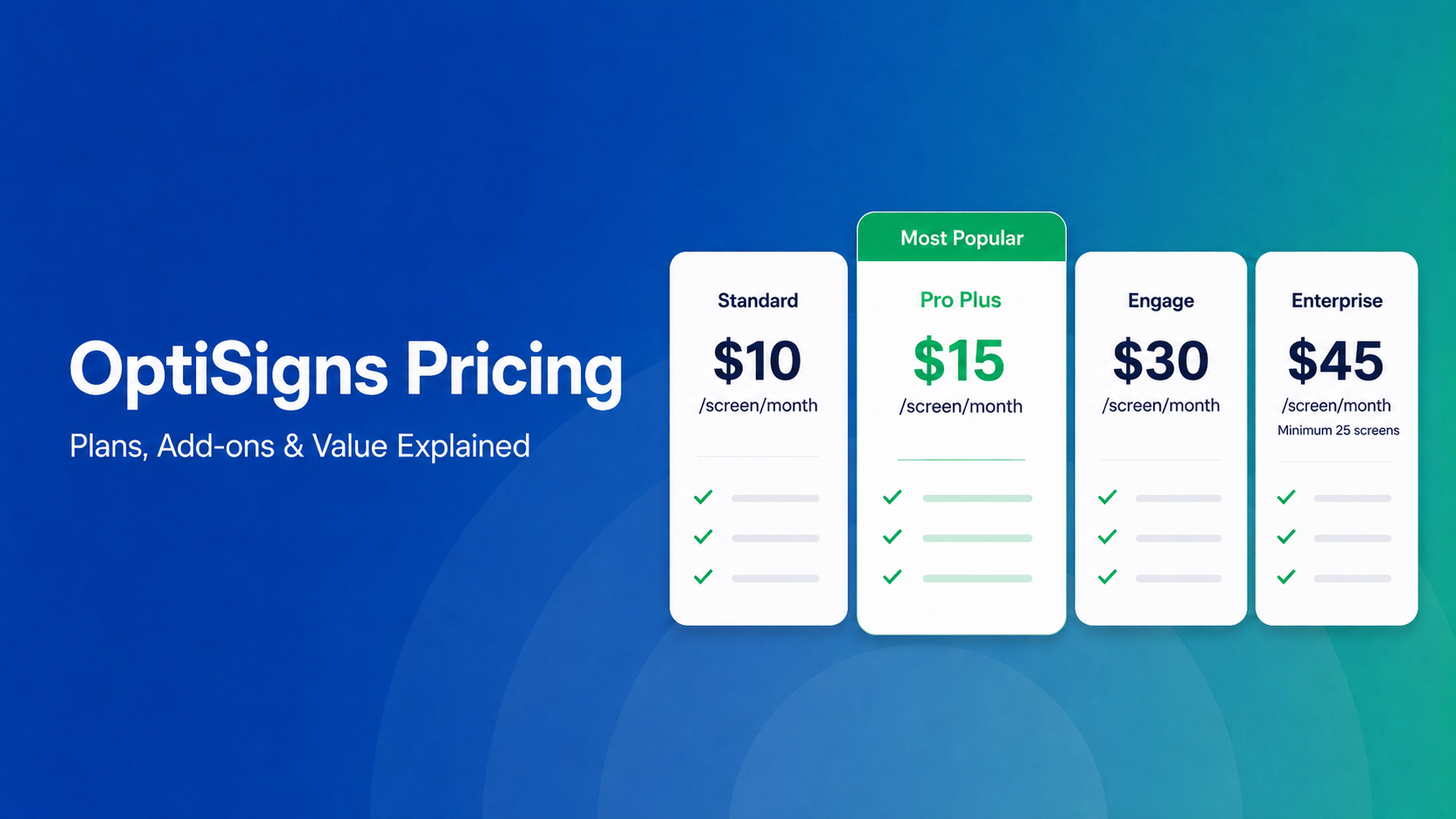
OptiSigns Pricing in 2026: Plans, Add-Ons, and What It Really Costs
OptiSigns' paid plans run $10–$45/screen/month ($9–$40.50 on annual billing). Add-ons for wireless presentation and video walls aren't included in any base plan, and phone support requires an upgrade[…]
Read More -
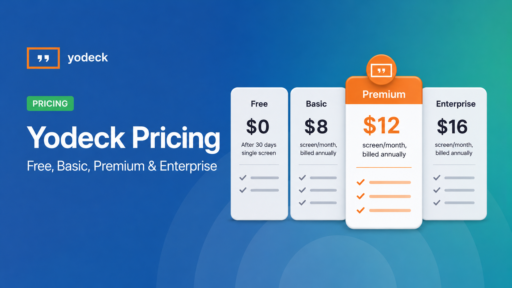
Yodeck Pricing: Plans, Costs & What Changed in 2026
Yodeck bills per-screen with no ceiling (free up to $16/screen/mo) so costs rise with every display added. 2026 Price Increase: Yodeck raised Premium and Enterprise plans by $1/month per screen,[…]
Read More -
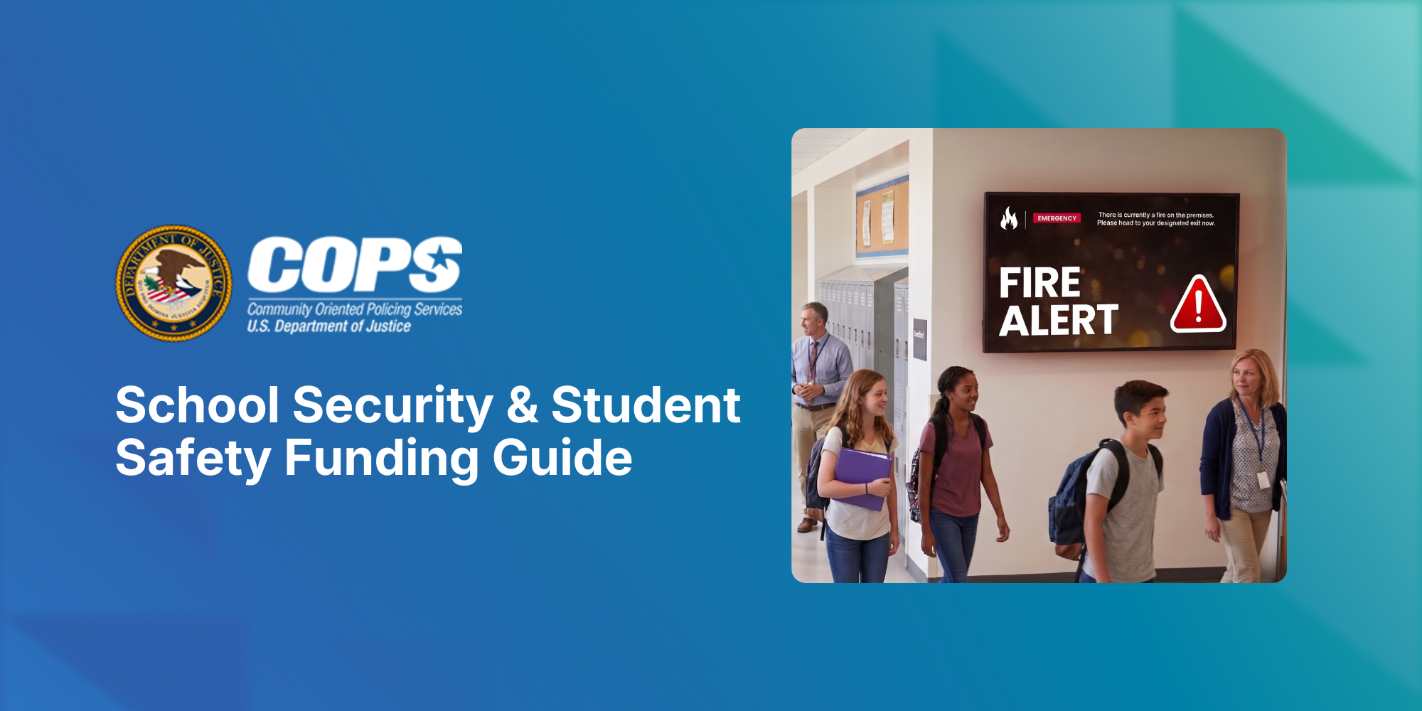
The COPS School Violence Prevention Program: A K-12 District's Guide to Federal Funding to Support Student Safety
Every year, school districts are asked to do more with less: keep students safe, keep communication clear, and keep budgets in check, often all at once. The School Violence Prevention Program (SVPP)[…]
Read More
12,300+ Organizations Trust Rise Vision, You Can Too


Schedule a Free Demo
You deserve the #1 all-in-one platform for digital signage, screen sharing, and emergency alerts.


