How to Use Color Theory In Digital Signage Design
What Makes a Good Digital Signage Design?
There's a science to colors that extends to business. Did you know one of the most common colors in the entertainment industry is red, for example? Red can create a sense of excitement and energy that fit the industry. Blue creates a sense of trust and security, which is why you see it so often at hospitals and financial institutes. What's the right color for your business and further the digital signage you use to visually communicate your message? We'll show you in this post.
When you're done, you can create free digital signage by clicking on the link below and test out what you have learned.
Strong design leads to engaging digital signage, and for all of us non-designers out there, it can be quite intimidating. But taking the step towards an appealing, effective design is easy, it just requires some practice and consideration. One of the major elements to good design is color theory.
Color is the first thing people notice, and it leaves an instant impression of your brand, product or message. A study titled “Impact of color on marketing” found that 90% of judgments made about products can be based on color alone, and though you might not be using your signage to market a product, you are selling a message.

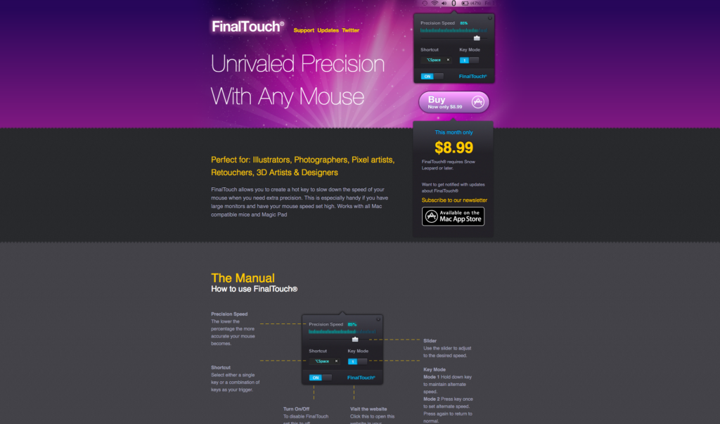
Take this presentation for example. That color combination is enough to ruin any appetite.
A strong design, and inevitably strong digital signage uses a balanced, appealing, color palette. Your color palette is used consistently across your design and is meant to compliment your content. You should consider its effect on the viewer, and it’s effect on the legibility of your message. A good palette provides consistency to your design and reinforces your message.

A simple change of color can change the entire look and feel of your design.
Color Terminology:
The first step to choosing your color palette is understanding color theory and establishing a vocabulary for communicating color.
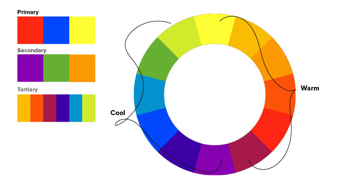
The Color Wheel
- The color wheel is the basic tool used for combining colors. Many versions of the color wheel exist, but the most common version is a wheel of 12 colors, incorporating the primary, secondary and tertiary colors.
Hue
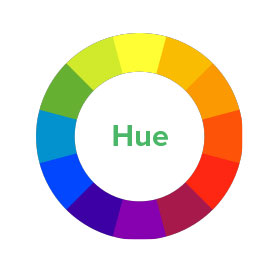
- Hue refers to pure colors. All colors represented in the 12 spoke color wheel are fully saturated hues.
Tint
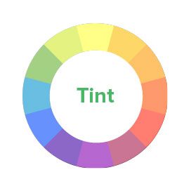
- A tint is a modified version of a hue. Tints are created by adding white to hues. All pastels are tints of a color.
- Designers often add tints to their palettes to give their palette some body.
Shades
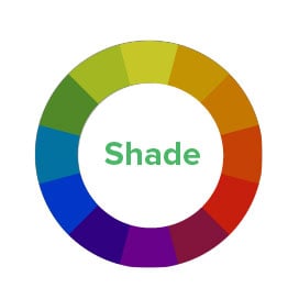
- Shades are any color with black added.
- Use black carefully as it can easily darken and destroy the hues of a palette. Dark shades of color are a better replacement for black.
- In digital signage, dark shades are commonly used as background colors to allow for contrast between bright text and images.
Tone:
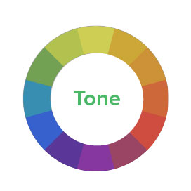
- You now know how to lighten and darken a color so how do you tone them down? The most appealing designs use tones of colors. That is because fully saturated colors can be very jarring for the viewer.
- Tones are created by adding both white and black, resulting in gray. Tones are essentially “grayed down” versions of a color.
- These are much more pleasing to the eyeand carry a fuller look.
Saturation:

- Saturation defines a range from pure (100% color) to gray (0%) at a constant lightness level. It can be described as weak vs. strong.
- In design, colors of similar saturation appear harmonious and well balanced. Varying saturation levels can make a palette look busy and unbalanced.
Chroma:
- Chroma is the purity of a color. A hue with a high chroma has no black white or gray in it. Adding these reduces chroma. Chroma can be described as the brightness of a color as it compares to white. When designing, use hues of varying color.
Contrast:
- When referring to colors, contrast means the difference between colors.
- When it comes to digital signage, you want to achieve a high contrast between the color of your background and the color of the text on your screen. A large difference in contrast will allow the text to stand out and be legible.
 The high contrast between the bright white and red hues, and the darker shade of the background allows the text to pop, making the message easy to read at a glance.
Primary Colors: Red, Yellow, Blue.
- Primary colors are the 3 pigment colors that can not be mixed or formed by any combination of other colors. All other colors are derived from these 3 hues.
Secondary Colors: Green, Orange, and Purple
- These colors are formed by combining the primary colors.
Tertiary Colors: Yellow-orange, red-orange, red-purple, blue-purple, blue-green & yellow-green
- These are the colors formed by mixing a primary and a secondary color.
Warm and Cool Colors
Color can easily be grouped into warm and cool colors, which is how they are commonly applied in design. Having a good understanding of these color groupings and their effects will serve you well when it comes to building your palette.
Warm Colors
Warm colors include red, orange and yellow, along with their derivatives. These colors can produce feelings of excitement, passion, and positive thought when applied in design.
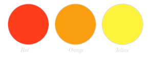
Red (Primary Color)
Red is very hot color and attracts attention more than any other color.

Psychology of Red:
A bold, saturated red can create excitement, and has actually been proven to raise a person’s blood pressure. Use red to signify importance, danger or youthfulness, or to strike feelings of hunger as red triggers appetite.
If you’re creating a menu board or advertising an event, you would be wise to use hues of red in your design. This way, your message will have the desired effect on your audience.
Using Red In Design:
Overuse of this color can be very intimidating and overwhelming for the viewer, especially when it comes to digital signage. Use red and its derivatives (shades of pink and pinky-red) to accent your designs. Lighter shades of this color can create an energetic feel while darker shades will seem more powerful and heavy.
Red is a great accent for shades of white and gray. If your color palette features heavy amounts of red, consider showing your content in shades of white and gray.
Orange (Secondary Color)
Orange is vibrant and energetic.

Psychology of Orange:
When applied to a brand or design, orange can create a feeling of friendliness. It can also create a feeling of change, and fresh ideas. Orange has traits of confidence and cheerfulness.
Using Orange In Design:
Designs that incorporate orange command attention without overpowering your content. Orange is often a friendly and inviting color to use in design. It is a great alternative to red and is perfect for welcome messages, or for advertising an event.
Yellow (Primary Color)
Yellow is bright and energetic.

Psychology of Yellow:
Yellow is associated with happiness, joy, intellect, clarity and warmth.
Using Yellow In Design:
When used in design, yellow can create a feeling of optimism. If yellow is used to accent cool colors, it can create a warming effect.
Saturated yellows are attention grabbing, but if overused, yellow can have a disturbing effect.
Bright yellow can create a sense of happiness and cheerfulness. Softer yellows can create a sense of calm. Darker, more golden-yellows can create a sense of loyalty and permanence due to their antiquey feel.
Cool Colors
Cool colors contain higher amounts of blue, which creates an icier feel when used in design. A cool palette evokes thoughts of winter, water, nighttime, sadness and a general chill. This palette can often cause a feeling of loneliness or fear. Cool colors are generally subtle and soothing.
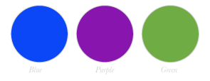
Blue (Primary Color)
Blue is often used to convey sadness, calm or responsibility.

Psychology of Blue:
Blue is often used to convey a sense of trust and is associated with traits of dependability.
Using Blue In Design:
Lighter blues can make a design appear lighter and friendly, whereas darker blues are more strong and reliable. If your message is meant to carry authority and a sense of reliability, opt for a darker palette. If you’re hoping to energize and excite your audience, go for bright blues.
Green (Secondary Color)
Green is a common color in nature. As such it is often associated with growth, freshness, and fertility.

Psychology of Green:
Green is associated with the earth, feelings of renewal, peace, abundance and growth. Green can produce negative feelings of envy or jealousy, and sometimes a lack of experience.
Using Green In Design:
When used in design, green can have a balancing and harmonizing effect. This is a very stable color for design and is appropriate for designs related to wealth, renewal, growth, and nature. Brighter greens will create a more energizing and vibrant feel, whereas darker greens will appear more stable and affluent.
Purple (Secondary Color)
Purple has been associated with royalty, creativity, and imagination.

Psychology of Purple:
Dark purples are often associated with wealth and royalty whereas lighter purples can create feelings of romance.
Using Purple In Design:
Purple is derived from combining red and blue, and can take on the attributes of both of these hues.
Dark purples can create a sense wealth and luxury, while light, softer purples are associated with spring and romance.
Choosing a Color Palette:
So now that you have a grasp of the color families and their effects, you can begin piecing together your palette based on the effect you want it to have. A color palette is simply a combination of 2 or more colors chosen from the color wheel. Your palette will dictate the colors you chose for your text, graphics, images and background and will guide the look and feel of your content.
If you’re designing signage that is going to be displayed in your company’s office space, then you’ll want to focus on branding. If you’re using signage in your restaurant, you’ll want to use a palette that encourages appetite and compliments your brand. If you’re showing a message in a university or bank, you’ll want to reinforce a sense of authority and reliability. All of this can be achieved with the right palette.
Color Schemes:
Monochromatic

If your logo includes a single color then you might want to go for a monochromatic color scheme that is suited to your company styles. A monochromatic color scheme is developed using a single color and its derivatives.
To accomplish this palette you’ll want to decide on your color, and then chose some lighter and darker hues and shades of that color. An easy tool for developing a monochromatic color palette or any palette at all is Adobe Kuler - all you’ll have to do is plug in your main color and it will do the rest.
 This color scheme is great for brands that use only one color in their styling. Spotify has done a great job of applying a monochromatic color scheme through a soft green overlay.
Pros:
- Easy to use and manipulate
- Monochrome color schemes create a feeling of simplicity and harmony. This subtle palette will emphasize any content in your design.
- Monochromatic color schemes are more accessible and more appreciated by viewers with color blindness.
Cons:
- Lacks the vibrancy of other color schemes due to a lack of contrast within the palette.
Tips:
- If you’re choosing to go monochromatic, make sure you’re considering contrast. If you’re design lacks contrast you might find that nothing stands out creating a 1 dimensional feel. Colour Contrast Checker is a great tool for checking the contrast of your designs.

This site uses a monochromatic color scheme very effectively. Notice the significant difference in contrast between the background and the site’s content.
Analogous
This is the next easiest color scheme to create and work with. Analogous schemes are comprised of 3 colors that are next to each other on the color wheel. For best results, make one color your dominant color and use the others to accent.
Pros:
- Easy to create
- Richer look than a monochromatic scheme
Cons:
- Lacks bold contrast
Tips:
- Avoid using too many hues
- To increase the contrast between colors, decrease the palettes chroma.
- Avoid combining warm and cool colors
 The blue, blue-green, green palette used as the background this presentation created by the Rise Creative team is a perfect example of how an analogous color scheme can be used for digital signage.
Complementary

A complementary scheme is created by combining colors from opposite poles of the color wheel. A basic complementary scheme includes only two colors but can be grown by taking their tones, tints and shades.
Decide on one color as your primary color and use the other for accents and compliments. For example, if you chose to use red and blue, you can make to either red or blue your dominant color and use the other for small details and graphics. Equal use of the two can make your design appear as if it is vibrating on the screen.
Pros:
- This palette is high contrast which makes for a seemingly richer design that commands attention.
Cons:
- It’s hard to achieve a balanced design with this palette. Your design choices will require prudent consideration and experimentation.
Tips:
- This scheme works best when a warm color is paired with a cool color.
- Avoid using complementary colors of the same chroma right next to each other as this can have a jarring effect on the user.
 The complementary color scheme works very well in this presentation. The designer has chosen to make the blue-green the dominant color, using the orange-yellow as an accent color.
Split Complementary
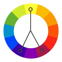
To apply this color scheme, choose a color, then go to the hue directly across from it on the color wheel and select the two adjacent to it.
Pros:
- This color scheme is high contrast, without the jarring effect of the complementary scheme.
Cons:
- It becomes more difficult to achieve a balanced look with this color scheme. Monochromatic and Analogous are much simpler for this.
Tips:
- Chose one warm color to use against a range of cool colors. This will put an emphasis on the warm color.

This site uses orange-yellow to accent the purple-blue and red-purple colors that are being heavily applied in the background.
Triadic
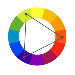
A triadic color scheme takes three colors of equal spacing on the color wheel.
Pros:
- This scheme delivers a high degree of visual contrast and balance, and avoids the competing tensions often seen in complementary color schemes.’
Cons:
- The level of contrast is not as great as a complementary scheme.
Tips:
- Using one pale or dark version of the one color in the triad, along with two shades/tones/tints of the other two colors makes the single color work as a neutral within the scheme.
- For a more intense result, use one very bright hue paired with muted hues to make the bright hue stand out more.
This presentation uses a soft triadic palette to advertise an after-work event. The soft orange-yellow serves as the perfect background for the bolder yellow-orange and blue.


This presentation uses a soft triadic palette to advertise an after-work event. The soft orange-yellow serves as the perfect background for the bolder yellow-orange and blue.
Tetradic
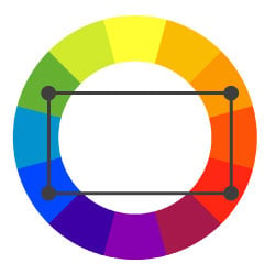
This color scheme creates the richest appeal but is definitely the hardest to execute. It takes four colors, arranged in two complementary pairs. The best way to visualize this is to draw a rectangle on your 12 point color wheel. The points where the rectangle lands are the colors to a tetradic palette.
Pros:
- A richer variety than any other palette
Cons:
- Hardest to achieve balance
Tips:
- Avoid using pure colors
- Have a dominant color
 This presentation uses a rich tetradic palette, applying the cooler hues in greater amounts.
Creating Your Own Color Scheme
This option is not as daunting as it seems. However, it does require that you pay close attention. If you’re choosing to create your own palette, keep in mind that your colors should have consistent chroma, value and saturation levels. If these vary, your palette may become hard on the eyes.
There are several easy tricks to creating a custom color scheme. The first technique takes a traditional Monochromatic palette and adds a neutral shade.
For other varieties of a traditional palette, consider removing a hue from the palette.
If you’re using a monochromatic palette of shades of grays and whites, consider heightening the contrast of your design by adding a more saturated accent color for visual interest.
In fact, an easy way to go about this is by starting with a typical color scheme and substituting a hue with a neutral color.
Flat:
Flat color palettes are all the rage in web design right now. If you’re not familiar with the term ‘flat’, it means that the hue (or color) has solid ink coverage with no gradations or halftones. The color is consistent throughout, resulting in a flat appearance. As a result, this palette is heavily applied in “flat design”, which means 1-dimensional design created from single toned hues. Flat design uses bright but muted colors, and all dimension is created through “flat shadows”. This style is characterized by its minimalist appearance.
To apply a flat color palette to your digital signage, follow the techniques of the previous color schemes, but switch out the hues for their flat derivatives.
Things to consider when creating a color scheme:
- Shy away from using a palette made from pure hues. A palette made from pure hues will look both busy and bland.
- Avoid using fully-saturated hues. Fully saturated hues are hard on the eyes and command a lot of attention. Go for tones, shades and tints of a color as this is easier for the viewer to digest.
- Don’t forget your neutrals! Grays, blacks, whites, browns, off-whites, and tans can help to neutralize your palette and design. Yellow-y shades such as browns, tans and off-whites can make your design appear warmer. Grays, Blacks, and whites can appear either warm or cool depending on the rest of your palette.
How Many Colors Should I Use?
Most palette generators will produce a palette of 5 colors. This is a good sized palette to use as it leaves a lot of room for diversity in your design. However, even use of the hues in your design can lead to a finished product that appears either busy or boring. To avoid this, a lot of designers will design using the 60-30-10 rule. This rule uses only 3 colors, often created using a triadic color scheme. The dominant color can be used in 60% of the design, the secondary in 30% and the last should only be used for accenting the design, and thus assumes the last 10%.


Using the 60%, 30%, 10% rule when designing is often a foolproof way to ensure a balanced and appealing design.
Color Resources:
There is an abundance of color palette resources available to you. Here are some great ones that will help you achieve a variety of different things with your palette:
Coolors is a quick way to get inspiration for a color palette.
Adobe Kuler is a great tool that allows you to generate palettes using different color schemes and it allows you to manipulate the chroma, saturation, and tint of your palette. It also gives you the HEX code and RGB values for your palette so you can copy it right into Rise Vision or any of your design tools.
Another great feature of Adobe Kuler is that it allows you to generate a color scheme from a photograph. So if you love the colors in one of your sunset pictures, or want to recreate the palette of one of your favorite flowers, import the photo into Adobe Kuler and it will generate a palette right then and there.
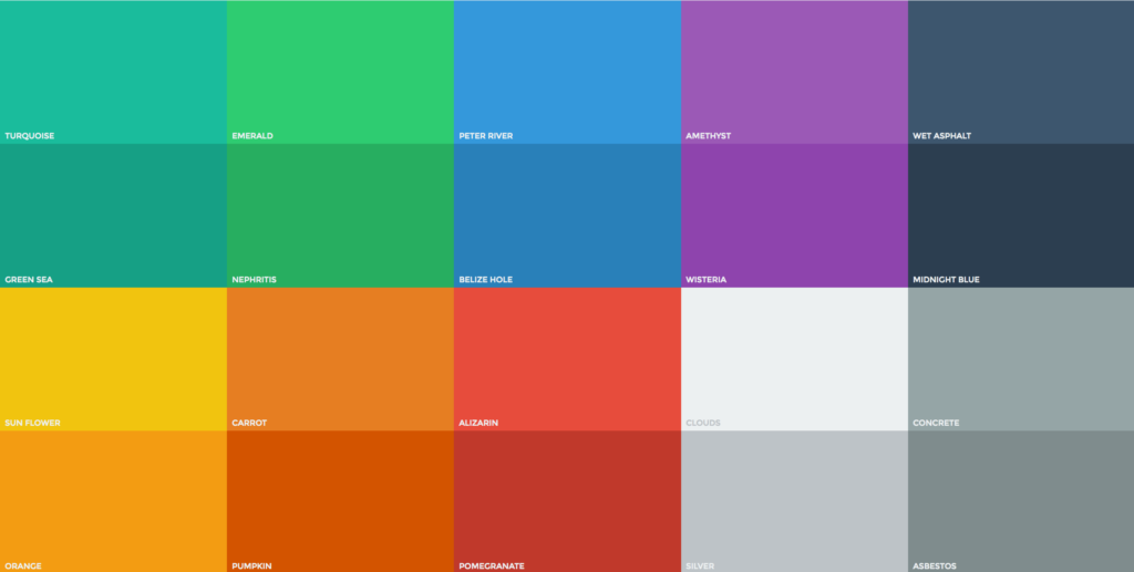
If you’re looking to get in to flat design, Flat UI Colors provides a great, ready-to-use list of flat colors to incorporate in your palette.
For an easier time, Flat Color Palettes has an extensive list of ready-to-use flat color palettes.
ColorPick Eyedropper is a great tool for sourcing colors from your favorite sites or designs.
This Chrome extension sits right in the top left corner of your browser and you can access the eyedropper to retrieve the HEX code or RGB value for any color you find while browsing the internet.
The Importance of Color In Digital Signage Design
A strong color palette can be the difference between a sorry sight and a bold and engaging message. Your color palette is the first thing people notice when they glance at your display. It can strengthen your message, and hold your audience better than any string of words, but if you’ve put no thought into it then you’ve lost your audience within the first 90 seconds of viewing. So chose your palette wisely as it is one of the most impactful design changes you can make.
Want to start a project of your own? Have a design related question?
Feel free to shoot creative@risevision.com a message! We're happy to discuss any design ideas you may have.
If you'd like to improve communication using the #1 digital signage software solution, you can check out how Rise vision works, as well as some great design examples, past customers and the benefits of digital signage for different industries!
Try Rise Vision free for 14 days
No credit card required · Set up in under 10 minutes
More From Our Blog
-

Lindbergh Elementary Strengthens School Culture and Student Recognition with Rise Vision
Lindbergh Elementary is the smallest school in Kansas City Kansas Public Schools, serving approximately 175 students. The small but mighty school is led by Principal Dr. Dustin Wiley who is known for[…]
Read More -
%20(1).png)
What’s New at Rise Vision: Q1 2026 Feature Roundup
At Rise Vision, we believe that effective communication should be simple, affordable, and impactful. Whether you’re a school keeping students safe or a business engaging a deskless workforce, your[…]
Read More -

Best Cloud-Based Digital Signage Software
Managing screens across a building, a campus, or a dozen facilities used to mean someone physically touching each display every time something changed. Cloud-based digital signage software removes[…]
Read More
Keep Your Displays Interesting – Pick New Templates Every Week!
Every week, we send template recommendations that will make you look great and improve your audience experience. And the best part, they save up to 16 hours of content creation time every week!
12,300+ Organizations Trust Rise Vision, You Can Too
Schedule a Free Demo
You deserve the #1 all-in-one platform for digital signage, screen sharing, and emergency alerts.


