
Digital Signage Best Practices for Education
The shrinking cost of displays and digital signage software has made digital signage on school campuses a feasible solution for any school on any budget. To be successful with your digital signage, however, you need more than just an affordable solution: you need a plan to execute your solution. Rise Vision has worked with thousands of schools, and become one of the top digital signage provider for schools; we’ve compiled a list of best practices to help make sure you are getting the most out of your digital signage for education CMS solution.
1. Text Size
The first thing you should consider as you create your free signs is the size of the text. Obviously, the 12pt font we typically use on a computer will not go well with a display that’s several times larger than our computers; so what font size is appropriate for digital signage? It depends.
The image below gives you an idea of where to start. A 150 inch TV screen, for example, will want to use a 400 size font; a 7 inch TV screen would be significantly less.
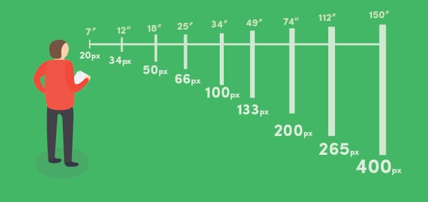
There is more to consider, however, than the size of the screen. Put yourself in the place of the viewer who will look at your display. If this display will be a welcome sign in your administration office, then the viewer will be about 5 feet away; if this display is going in your school cafeteria to display the lunch menu, then students may be standing in a long line and as far as 20 or 30 feet away.
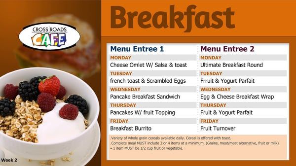
The Marysville School District has used Rise Vision to create a school breakfast / lunch menu for their campuses; the image below is an example of how they used the right size font to appropriately display their school menu digital signage for their students.
2. Use Space Appropriately
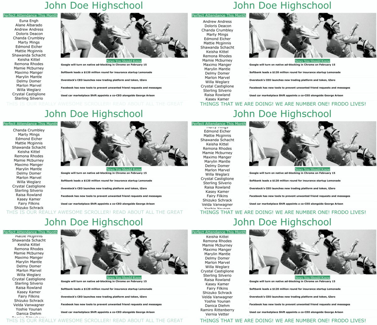
The larger the display, the more space you have to use, right? Technically, yes. Just because the space is there, however, doesn’t mean you should use it. The below example shows you how using your space wrong can be a complete disaster.
Digital Signage should be focused; there should be one clear message you are trying to get your audience to see--not several. The below example is from our template library, which users can use to create professional digital signage in minutes. In this example, one event is being promoted (talking to a career advisor). Take note of the ratio of text to image; the animation here also helps draw attention to the screen.

3. Color Theory for Digital Signage
There is no perfect color for your digital signage. The right color varies for each user. We have a post that helps explain color theory a little more; this is an excellent resource as you get started. The image below is an example of everything you can do wrong with digital signage! The colors are too bright and completely contrast one another.
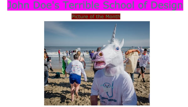 In almost every case, the logo of your school should play a role in the color that you ultimately decide to use.
4. Digital Signage Harmony
Promoting multiple things on one display is not always bad. There just needs to be a sense of harmony with what you are doing, and you have to space it correctly. The University of Colorado’s Business School is using their digital signage to blend images, RSS, and the school’s branding into one cleancut design.

If you are looking for digital signage software for education, and have questions about getting started, you can contact us. If you aren’t quite sure if a digital signage CMS is the best investment for your K-12 university campus, we have some things for you to consider.
Further Reading
Try Rise Vision free for 14 days
No credit card required · Set up in under 10 minutes
More From Our Blog
-
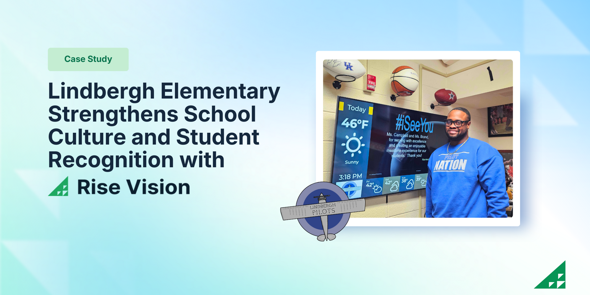
Lindbergh Elementary Strengthens School Culture and Student Recognition with Rise Vision
Lindbergh Elementary is the smallest school in Kansas City Kansas Public Schools, serving approximately 175 students. The small but mighty school is led by Principal Dr. Dustin Wiley who is known for[…]
Read More -
%20(1).png)
What’s New at Rise Vision: Q1 2026 Feature Roundup
At Rise Vision, we believe that effective communication should be simple, affordable, and impactful. Whether you’re a school keeping students safe or a business engaging a deskless workforce, your[…]
Read More -

Best Cloud-Based Digital Signage Software
Managing screens across a building, a campus, or a dozen facilities used to mean someone physically touching each display every time something changed. Cloud-based digital signage software removes[…]
Read More
Keep Your Displays Interesting – Pick New Templates Every Week!
Every week, we send template recommendations that will make you look great and improve your audience experience. And the best part, they save up to 16 hours of content creation time every week!
12,300+ Organizations Trust Rise Vision, You Can Too
Schedule a Free Demo
You deserve the #1 all-in-one platform for digital signage, screen sharing, and emergency alerts.


