
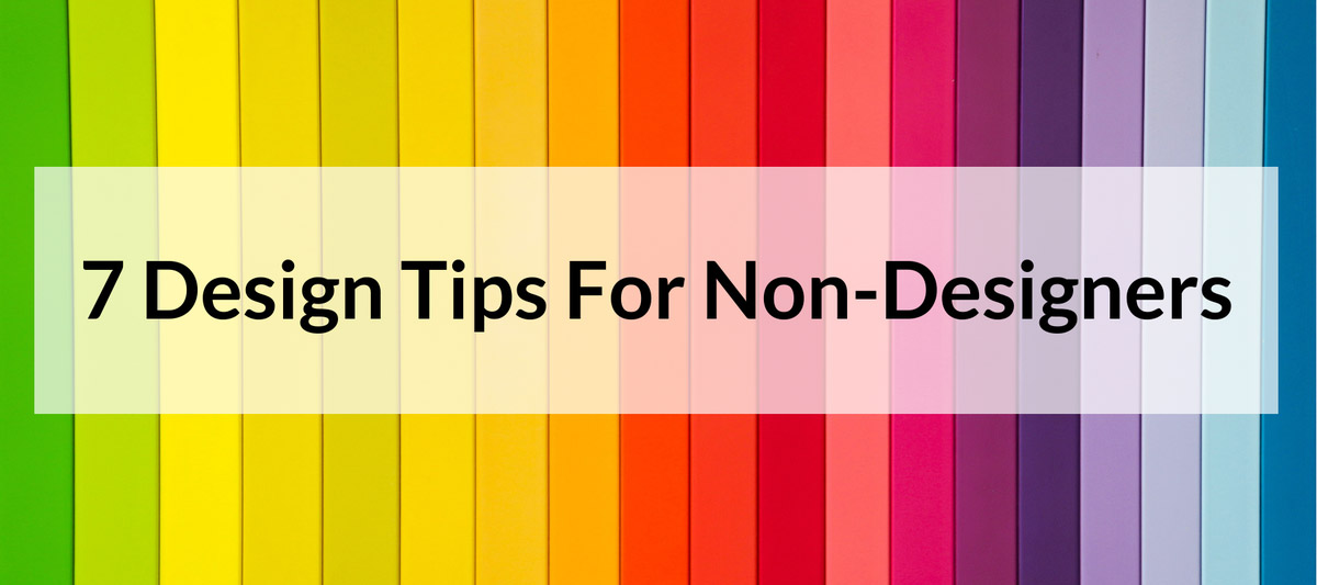
Not everyone has the skills to be a designer. Some of us set out to draw on a blank canvas and end up with what looks like stick figures. This is unfortunate in a world that is so visual. How does a non-artist survive in a world so driven by art? While not all of us are born an artist, there are plenty of tools and tricks to help us create beautiful designs. Here's our 7 tips to hack your way to a masterpiece and make everyone think you were born an artist!
When Colors Collide
What’s wrong with the photo below:
No, it’s not the man with the unicorn head--although that is a terrifying image!

It’s the colors!
To be more precise, it’s the contrasting colors.
Colors should go together in harmony. Not sure how? You aren’t alone. We have a post on color theory that will make sure you are making the right color decisions.
A Picture is Worth a 1000 Words
Text is hard for non-designers to resist. It’s much easier to type something than draw something, after all. But be careful or you’ll end up with something like this:

It’s hard--albeit impossible--for the viewer to know what they are supposed to be focusing on, and, in fact, most people will be so overwhelmed by it that they’ll ignore it altogether.
The below is a template that you can use with your digital signage that shows this concept:

One Font is Better Than Two
Speaking of text, let’s talk font. Fonts make it easy for you to be fancy! But use them sparingly.
In digital signage design, don’t use fonts that are hard to read (like cursive, which can be hard to read on a screen), and if you're unsure of your design skills it's safest to use one font.
If you want to give your design some visual separation/hierarchy use 2 weights of the same font or fonts from the same family.
For example, you could use Roboto Regular and Black or Roboto Regular and Roboto Slab.
Multiple typefaces make it harder for the eye to read. Use no more than two--but preferably one.
You can use the template below to apply this concept.

No Crowding!
In design, space is everything. Your graphics and text should be evenly spaced, but also leave whitespace between objects. Overcrowding should never be a problem in what you are designing. Overcrowding makes it difficult for the eye to separate where one object starts and another begins.
Below is an example of one of our templates that you can use on your display that shows effective spacing.

Instead of several “zones” with lots of text, create multiple presentations that transition every few seconds.
Scale to New Heights
The easiest way to emphasize your message is to scale the text or picture. When there are multiple photos on your display, make sure you scale to emphasize where the viewer's eyes should focus. The photo or text you want to emphasize should be the largest one on the display.
Read more about best practices for your digital signage here.
The Wonderful World of Free!
The easiest way to create graphics when you don’t have the time or talent is simple: don’t!
Websites like TheNounProject have thousands of professional graphics that can be used with zero attribution.
If you are only after photos, then you’ll find even more options as there are millions of good photos in the public domain.
We have put together a resource of the best places to go for free graphics and photos; you can read it here.
Steal...Sort of
Pablo Picasso famously said, “Good artists copy. Great artists steal.” Non-designers have taken this quote to heart by simply copying others and making it their own--when it’s legal to do so, of course.
At Rise Vision, we encourage our users to steal the work that we spend hours creating and make it their own in minutes!
With our digital signage templates, you can easily turn this:
 Into this:

A new background, new text, your school's logo, the forecast and news for your city--all effortlessly changed in seconds with less than five minutes of work.
We have hundreds of templates just for schools that you can use today. Not sure how they work? Check out this page for more information or create your free account and use a template today.
Once you are ready to get started with your free account, here are some articles to read while you are starting out:
- Planning Out Your Digital Signage Content
- Digital Signage Best Practices
- 10 Reasons Your Digital Signage Sucks - And How to Fix It
- Digital Signage Layout with the Golden Ratio

More From Our Blog
-
7 Best Plant Floor Communication Tools in 2026: Better Communication for Production and Warehouse Teams
Quick Summary Plant floor communication tools help manufacturers reach workers who do not use email or desk-based collaboration tools during a shift. Rise Vision, Poka, and Beekeeper are among the[…]
Read More -
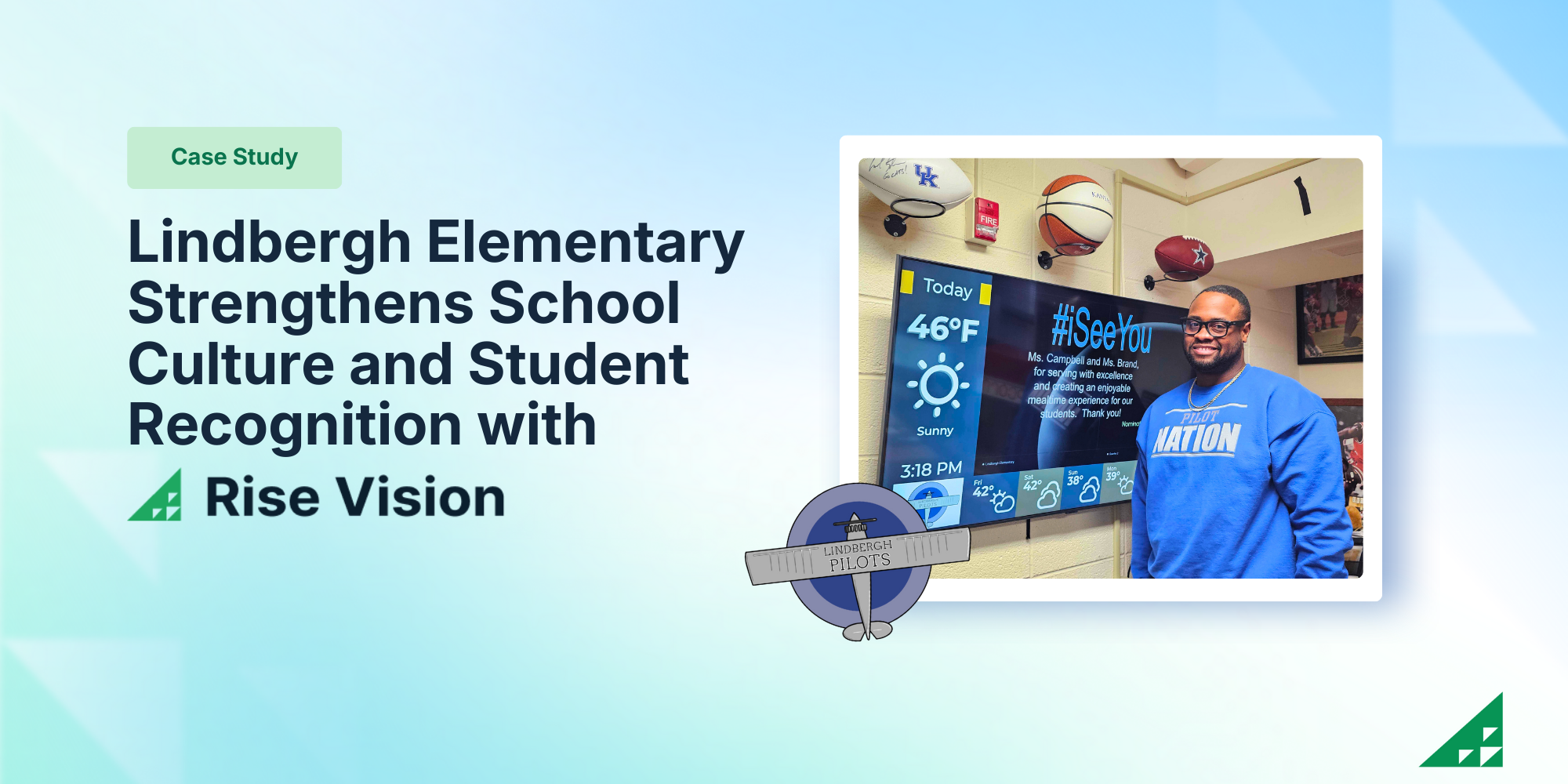
Lindbergh Elementary Strengthens School Culture and Student Recognition with Rise Vision
Lindbergh Elementary is the smallest school in Kansas City Kansas Public Schools, serving approximately 175 students. The small but mighty school is led by Principal Dr. Dustin Wiley who is known for[…]
Read More -
%20(1).png)
What’s New at Rise Vision: Q1 2026 Feature Roundup
At Rise Vision, we believe that effective communication should be simple, affordable, and impactful. Whether you’re a school keeping students safe or a business engaging a deskless workforce, your[…]
Read More
12,300+ Organizations Trust Rise Vision, You Can Too


Schedule a Free Demo
You deserve the #1 all-in-one platform for digital signage, screen sharing, and emergency alerts.


