
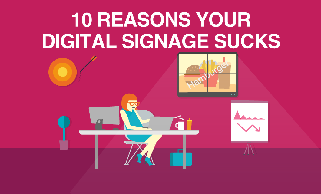
At first, you were excited to start a new digital signage project, but after you created an account, purchased a display, and created a presentation you started wondering. You’re wondering why your displays seem mediocre (at best), why engagement is trickling, and why despite your best efforts, compliments are few and far between when it comes to your digital displays. To put it shortly: your digital signage sucks.
Do you just need some help to get you started?
Or, is it possible that you’ve made some rookie mistakes? If you’re ready to admit this fact, then you have the chance to look into why your content is not performing and what you can do to improve.
Here are some of the most common reasons your signage is just not measuring up and how to avoid them. Be sure to take note if you’re guilty of any of the following mistakes and get ready to see some changes!
1. You’ve never considered contrast
Contrast is an excellent way to grab your viewers' attention and without the right use of it, your message will easily get lost. If your audience has a difficult time separating the elements of your display, how can you expect them to engage with it? Clear examples of contrast are black and white, big and small, thick and thin, and these elements can be used to improve your digital signs.
When considering contrast for your digital signage, a poor example would be a dark background with dark text, contributing to extremely poor legibility and almost guaranteeing your message will be overlooked. Proper use of contrast improves readability, creates focus, organizes information, and helps to direct the reader’s eye (exactly what you want!).
The color wheel below is an easy tool to use when choosing contrasting colors. Contrasting colors are those on opposite sides of the color wheel. The further away two colors are from each other on the color wheel, and the more directly opposite, the higher the contrast.

An easy way to improve your digital signage designs:
- Use contrasting colors – light on dark or dark on light
- Understand what your viewer’s eye is drawn to and focus on that
Although most people think of contrast only as it applies to colors, contrast can apply to other design elements. For example, contrast can be made using size by placing something big beside something small to indicate that the larger image is more important. Text styles can also be used to create contrast by using bold or italics or mixing large and small type to draw attention and to create contrast.
2. Your text height and viewing distance is off
Small text is probably one of the most common problems we see with digital signage. In general, time is not of the essence when it comes to digital signage, and the longer it takes for your audience to read your message, the higher the chance they will quickly move on. It’s hard enough to grab a viewer’s attention in the first place, so make sure your font size isn’t too small to add to the problem.
3. Your displays are not placed correctly
Digital signage that is set in the wrong place is a complete waste of effort, time and money. Just like any signage, the location of your digital displays is critical for success. To increase the likelihood of your audience noticing your signage, make sure your signs are not too high or too low. For most cases, eye level is the safest bet to ensure your signs don’t go unnoticed. Using the wrong angle can also affect the number of eyeballs you attract. If your digital signage is interactive, opt for a slightly upward angle, while signs placed above eye level with the aim of longer viewing should be angled slightly downward.
Before installing your signage, take the time to consider where your audience hangs out, where their eyes are naturally drawn, what you want your signs to help you accomplish, and the surrounding environment. This will help ensure you place your free dynamic signage in the best possible location and get the most value for your money!
4. You’re re-creating your website
Digital displays are meant to look beautiful, engaging, and straight to the point. If you’re trying to fit in too much text, or content in general, you will likely fall into the trap of trying to recreate your website on your screen.
You don’t have to be a design expert to ensure each presentation has focus, and your audience knows the message you are trying to convey. Avoid adding unnecessary content from your website and let your digital signage act as a stand-alone entity where your audience can get unique information they wouldn’t get by simply visiting your site.
5. Your fonts are inconsistent
Excellent digital signage always has consistent fonts. Any design that uses more than two different font faces (especially in the same sentence) will negatively impact how much of your message the typical viewer will read and understand before they move on with their day. The idea is to make your content as easy to read as possible to get your message across, and using a variety of font faces will only deter from that.
While we’re on the topic of fonts, a few other things to watch out for include:
- skewing your text
- using ALL CAPS to draw attention
- stacking lines too closely
- improper use of colored text (refer to the color wheel above)
There’s nothing professional looking about too many fonts, so as a general rule, never use more than two fonts for your design and only use italics if entirely necessary, since they can be hard to read from a distance. Finally, use large text and bold lettering to improve readability and avoid adding too many colors.
6. You’re missing a clear call to action
Realistically, you only have a few seconds to grab your audience's attention and a clear call to action is the perfect way to do so while also directing your audience. If however, your presentation is cluttered, and your call to action is either non-existent, hard to read, too small, or just not exciting, your audience will likely miss it.
Make sure your call to action is clear and rewarding for your audience. Focus on what your audience will gain by following you on social media, booking an appointment, or speaking to your team. Whatever you do, be concise and make it worthwhile for your readers.
The example below shows a clear CTA, which directs the audience.

7. You are using way too many zones
This concept is closely tied to the idea of posting way too much content on one presentation. Crowding your screen with too much information and using up every inch to fit as much as possible will only drive viewers away. Instead of using every zone in the presentation, try breaking up the information and consider creating 2-3 separate presentations in a schedule where each plays for about 30 seconds. This way you are still able to present the relevant information but not overload people with trying to fit it all in one go. Splitting the information between a few presentations will help ensure your audience can clearly understand your message while still being entertained by a variety of content. Also, don’t be afraid to use empty space as it helps draw attention to your core message!
8. You’re missing the right visuals
Trying to use images that are either not sized correctly or are heavily pixelated because they have been blown up from thumbnail size is a recipe for poor looking digital signage. Make sure you use high-quality images and consider the size and viewing distance when planning which visuals you will use on your displays. The perfect image is an excellent way to add a visual component but make sure it’s adding to your presentation and not detracting from it!
9. You don’t understand your audience
Knowing your audience is the best way to properly communicate with them using your digital signage. Do they prefer humor, entertainment, or facts and helpful tips? If you’re out of touch with your audience, then your content will likely not be relevant and won’t keep them interested in what you have to say.
Consider the following to help you plan your content:
- Who is your audience? (age, gender, income, personality, etc.)
- What are their needs, pain points, or challenges?
- What is their occupation or background?
- Where are they located?
- When do they typically interact with your signage?
- Why would they be looking at your display?
10. Your timing is way off
Animation is probably one of the best ways to grab your audience’s attention. As humans, we’re naturally drawn to anything that moves, and your audience will surely notice it if you incorporate it on your digital signage. However, too much movement and overwhelming animations can be disastrous and can completely distract your audience.
According to a study conducted by Intel, animated content generally receives five times more viewers than static content. Our advice is to keep it simple and stick to adding simple transitions between presentations or adding animation to draw attention to an image, such as steam coming from a hot cup of coffee. Overall, the key is to use movement sparingly, and only to make your signage more dynamic while avoiding too many distractions that will confuse your audience.
The Bottom Line
If you’re sitting here contemplating if your digital signage content sucks, that’s a pretty good sign. Achieving great digital content doesn’t necessarily have to be difficult, but ultimately, you get what you put into it. If you plan your content and follow our suggestions, you should be set to create visually appealing content that resonates with your audience. We promise the work will be worth it.
What are you waiting for? It’s time to improve your content!
P.S. If you still think you need help, or just don’t have the time to devote to improving your digital signage, we have a team dedicated to creative services and creating beautiful digital content. Get in touch with us, and we’ll work with you to create something great.
Digital signage has never been so easy.
More From Our Blog
-
Digital Signage Best Practices for Schools and Organizations
Effective digital signage starts with legible design, accessible contrast, and content that matches your viewing environment. Keep screens current with a content plan, make updates simple enough for[…]
Read More -
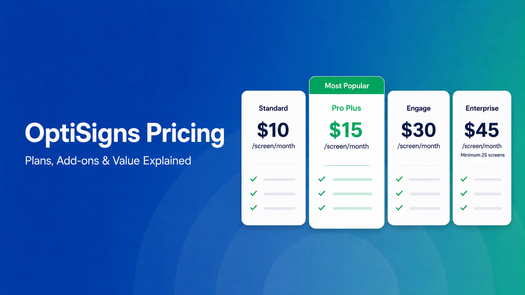
OptiSigns Pricing in 2026: Plans, Add-Ons, and What It Really Costs
OptiSigns' paid plans run $10–$45/screen/month ($9–$40.50 on annual billing). Add-ons for wireless presentation and video walls aren't included in any base plan, and phone support requires an upgrade[…]
Read More -
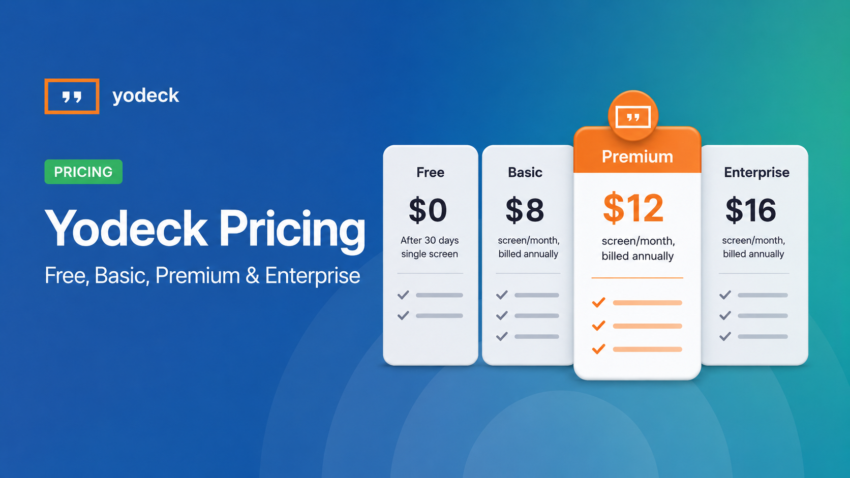
Yodeck Pricing: Plans, Costs & What Changed in 2026
Yodeck bills per-screen with no ceiling (free up to $16/screen/mo) so costs rise with every display added. 2026 Price Increase: Yodeck raised Premium and Enterprise plans by $1/month per screen,[…]
Read More
12,300+ Organizations Trust Rise Vision, You Can Too


Schedule a Free Demo
You deserve the #1 all-in-one platform for digital signage, screen sharing, and emergency alerts.


