
In this previous post I went over how to plan out your digital signage set up. Once you’ve done that you get to do the fun part… Building the content. Sometimes people get a little excited (I am definitely a culprit) and try to put as many things on their display as possible. The problem is that we have an incredibly short attention span. Some say shorter than that of a goldfish. So for every extra widget you put on your display, you take away attention from what could be more important.

This is why in the previous post we went over how to find what content is most important to your audience and what content will help you achieve your goals. For example if you’re a retail store and your goal is to use interactive signage to drive sales then it doesn’t make sense to put a clock, a weather widget, a video and some text on your display. Because each extra piece of content will take attention away from your message.
I’ll use a university for this example and go over three pieces of content, good, better and best. However, bear in mind that there are scenarios where it is okay to have multiple zones. For example, if your signage is in a waiting room or lobby where people will be spending a lot of time.
Rise University
Rise University recently invested in digital signage displays. They want to display donor information in a high traffic hallway of their new library. There are two displays hanging from the ceiling of the hallway. The displays are back to back so that you can see the content from both sides. Right now the main goal of their signage is to showcase donors and their secondary goal is to show school news.
Good Digital Signage Content

This content works, it shows viewers who the donors are, as well as weather, tweets, news and a QR code for the Rise University website. There are a few problems though. The fonts are too small, no one will be able to read all the information, and the other content is distracting. If the university is trying to promote their donors it doesn’t make sense to display so many other things at once.
Better Digital Signage

This version is better. The main focus is on the donors, that section now takes up two thirds of the screen. There is still a lot of clutter though. The Twitter Widget is too small for anyone walking down a hallway to read and the Weather Widget isn’t helping their primary goal.
Best Content Design

In this last version all the focus is on the donors. The constant movement attracts the audience's attention and each donor is shown for a few seconds. There are no other distracting elements on the page, only the important content. If they also want to show Tweets and campus news they could create a separate presentation and have the two presentations rotate.
When you’re creating content remember to think about who the audience is and what the goal of your digital signage is. It’s better to do one thing at a time really well, then try and do many things poorly. If your goal is to feature your donors, make them the center of attention for a longer period of time and show the news for short spurts in between.
If you have questions, suggestions or comments let us know below! You can also learn more about digital donor walls here.
Want more digital signage design resources? Check out the links below!
- 101 Digital Signage Content Ideas
- How to Use Color Theory in Digital Signage Design
- Golden Ratio for Digital Signage Design
More From Our Blog
-
Digital Signage Best Practices for Schools and Organizations
Effective digital signage starts with legible design, accessible contrast, and content that matches your viewing environment. Keep screens current with a content plan, make updates simple enough for[…]
Read More -
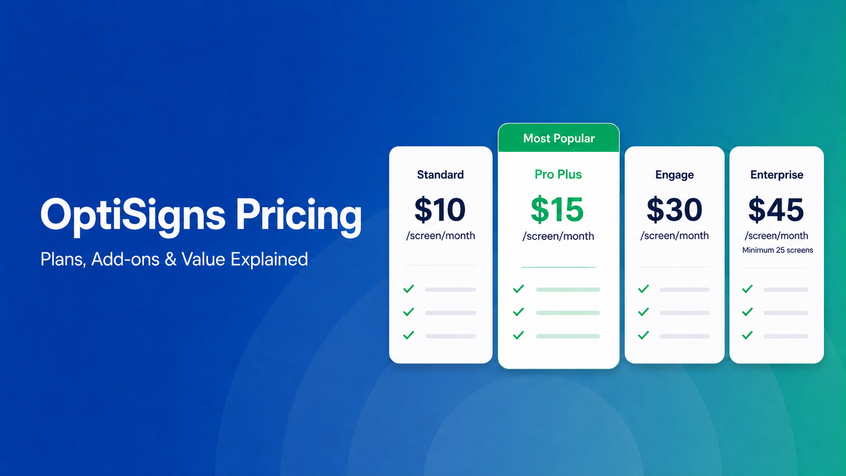
OptiSigns Pricing in 2026: Plans, Add-Ons, and What It Really Costs
OptiSigns' paid plans run $10–$45/screen/month ($9–$40.50 on annual billing). Add-ons for wireless presentation and video walls aren't included in any base plan, and phone support requires an upgrade[…]
Read More -
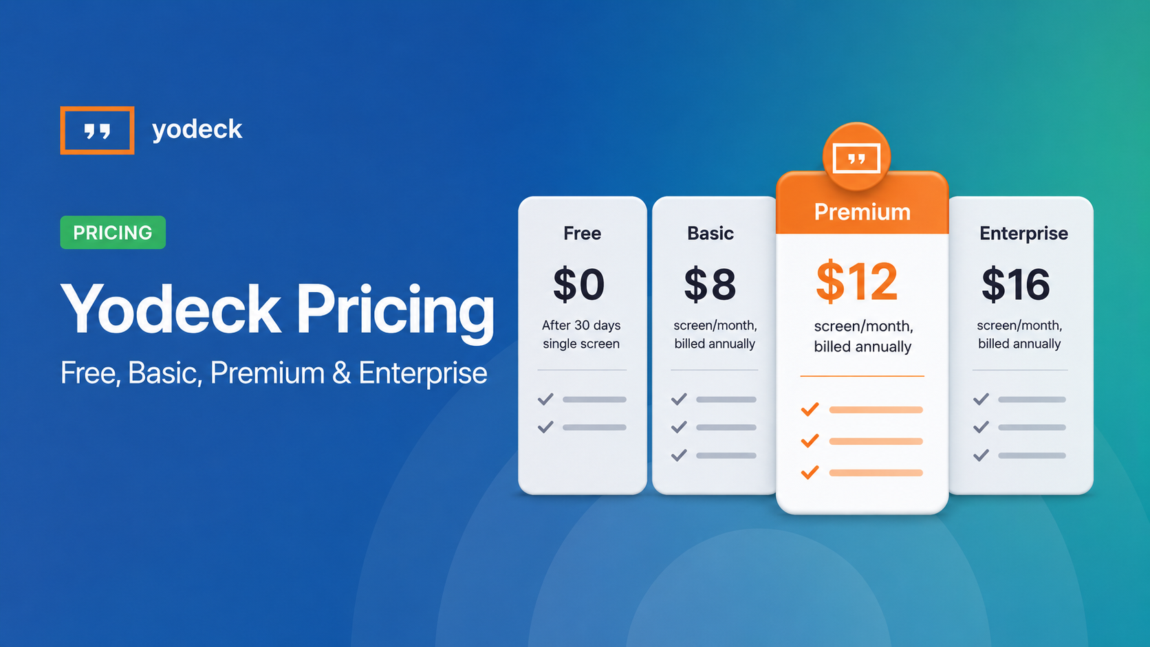
Yodeck Pricing: Plans, Costs & What Changed in 2026
Yodeck bills per-screen with no ceiling (free up to $16/screen/mo) so costs rise with every display added. 2026 Price Increase: Yodeck raised Premium and Enterprise plans by $1/month per screen,[…]
Read More
12,300+ Organizations Trust Rise Vision, You Can Too


Schedule a Free Demo
You deserve the #1 all-in-one platform for digital signage, screen sharing, and emergency alerts.


