

Digital signage has the ability to capture 400% more views than static displays and has a recall rate of 83%. These stats alone prove its superiority over traditional signage. By communicating content in a bolder and more dynamic manner, digital signage cloud software can help you draw your audience’s eyes to your display.
However, your digital signage is only as good as the design of your content. Readability, design layout, message placement, etc. all play a role in the attractiveness and effectiveness of your content. To help you assess your content’s legibility, general appearance, and layout, you should perform the squint test.
What is the Digital Signage Squint Test?
The squint test is an assessment of the design elements in your digital signage content. It evaluates the content’s readability, legibility, and focus, determining if your primary design elements naturally attract your audience’s attention.
How to Perform the Squint Test for Digital Signage

Performing the squint test is simple. Just deploy your content onto your digital signage screen, stand a distance away from it, squint your eyes, and navigate the display. While you’re doing this, assess the following:
- Readability: You should be able to read the text easily in the first few seconds of viewing the content with squinted eyes.
- Focal point: Identify which element in your content captures your attention first — this is the high-traffic section of your screen that naturally draws attention and is the best place to put key messages and calls to action.
Best Practices for Digital Signage Design
The squint test will give you insights into how well you’ve designed your digital signage content in the context of legibility and audience appeal. It should be a part of your content design process so you can correct readability issues and optimize your design for the best results.
To help your digital signage content pass the squint test every time, consider these best practices.
Increase Font Size
The font size that you should use will depend on the viewing distance of your screen. The further it is from the viewer, the larger your font should be to ensure readability. If you have to use a smaller font size to fit more text, you should reconsider your copy to use fewer words.
Use Sans-Serif Fonts
Sans-serif fonts are considered the most legible even when read from a distance. Consider using fonts like Arial and Open Sans for your digital signage content — they’re simple, readable, and straightforward.
Avoid using complicated novelty font faces. A survey found that 48% of customers say that fonts that are too fancy affect legibility.
Stick to Two Fonts Max
Mixing too many fonts in one design will make your content look busy, affecting how your viewer reads and consumes the information you present. It’s good practice to limit yourself to using a maximum of 2 fonts – one for the headings or copy that needs emphasis and another for additional text.
Avoid Italics
Italicized text is difficult to read at a glance and will take your viewer more time than necessary to make out the words in your content. Avoid italics as much as possible.
Pay Attention to Background Contrast
So your text stands out and is as readable as possible, it needs to have a strong contrast against its background. Use opposing colors for your background and foreground elements — light text on a dark background or dark text on a light background. Avoid colors that are too bright to prevent eye strain.
Reduce Movement
While having some form of movement makes your content dynamic, make sure you’re not overdoing it. Too many animations can easily overwhelm your viewer. Aim to have only one major animated element as the main focus of your design and keep the rest static.
Find the Most Optimal Transition Speed
Another important factor to consider is the speed at which you’re changing the content on your screen. The transition should not be too fast that your reader doesn’t have time to go through the content, but also not too slow that they get bored with the same display.
Create Readable and Attractive Content for Digital Signage
Every time you create new content for your digital signage, take some time to perform the squint test and make improvements as necessary to achieve optimal readability and layout optimization.
So you don’t have to put in all the time and effort creating new content for your screens, Rise Vision’s digital signage software includes over 500 customizable templates you can edit and immediately deploy for your audience to see.
Get a free demo of the Rise Vision's free cloud digital signage software.
More From Our Blog
-
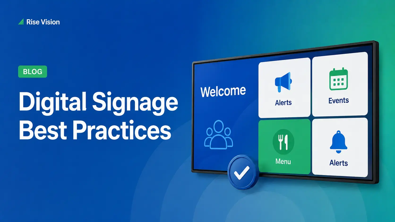
Digital Signage Best Practices for Schools and Organizations
Effective digital signage starts with legible design, accessible contrast, and content that matches your viewing environment. Keep screens current with a content plan, make updates simple enough for[…]
Read More -
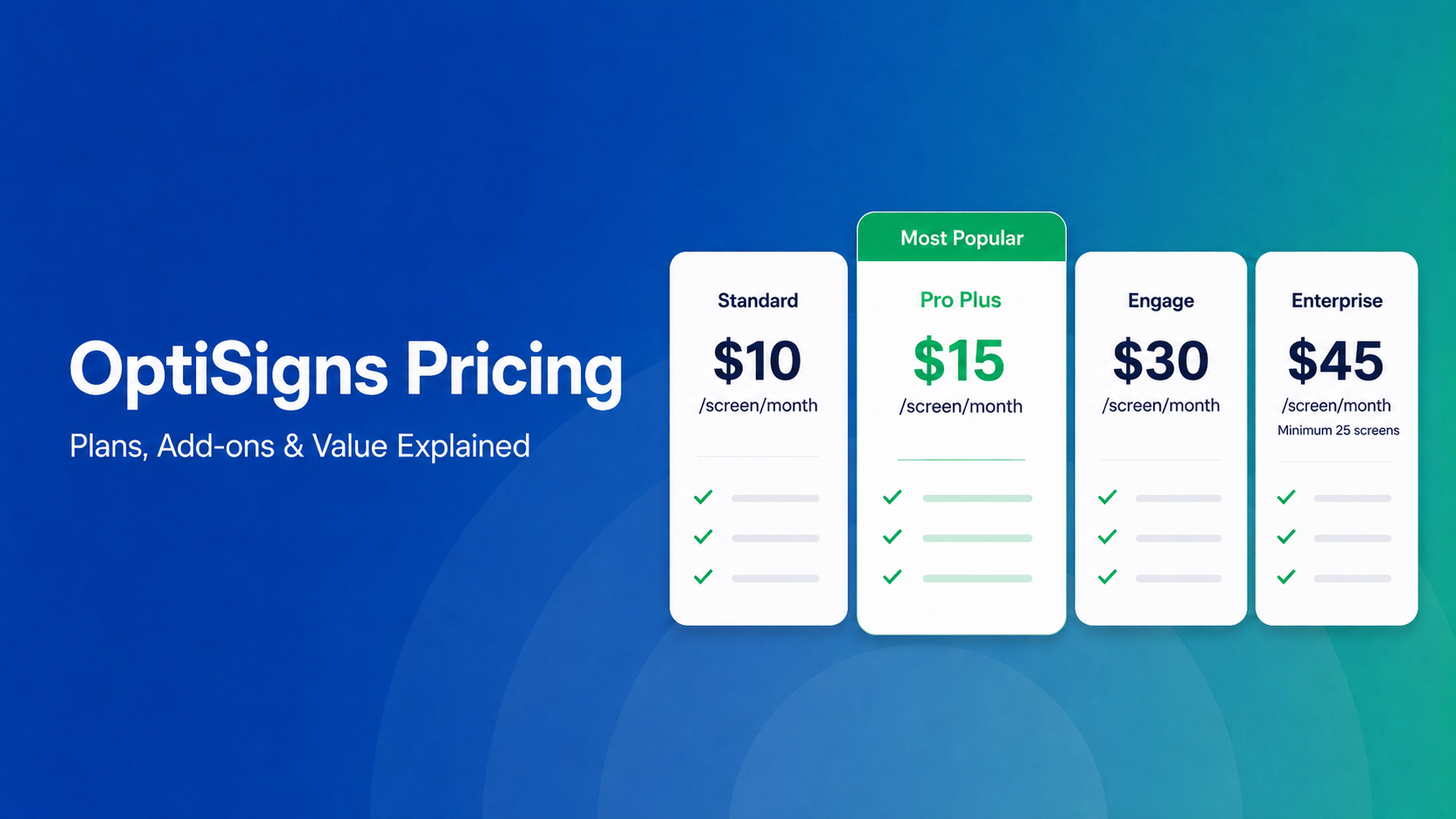
OptiSigns Pricing in 2026: Plans, Add-Ons, and What It Really Costs
OptiSigns' paid plans run $10–$45/screen/month ($9–$40.50 on annual billing). Add-ons for wireless presentation and video walls aren't included in any base plan, and phone support requires an upgrade[…]
Read More -
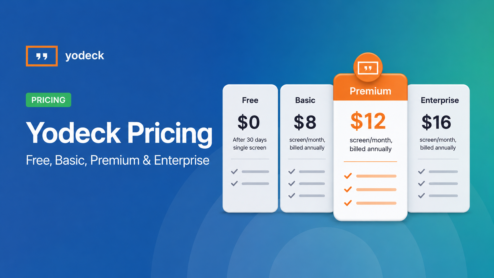
Yodeck Pricing: Plans, Costs & What Changed in 2026
Yodeck bills per-screen with no ceiling (free up to $16/screen/mo) so costs rise with every display added. 2026 Price Increase: Yodeck raised Premium and Enterprise plans by $1/month per screen,[…]
Read More
12,300+ Organizations Trust Rise Vision, You Can Too


Schedule a Free Demo
You deserve the #1 all-in-one platform for digital signage, screen sharing, and emergency alerts.


