
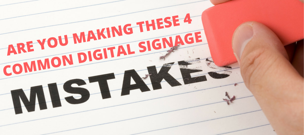
You’ve invested a lot of time and work into your digital signage, so why are people just walking by it and not giving it a second look? There are many things users do right with Rise Vision, but there are a few things that we see people do wrong. Below are four common mistakes users make when they create their presentation.
1. The War and Peace Digital Display
Pictures speak louder than words for most digital signs. Avoid long descriptions, lots of headers, and text in general--see the below example to see why having too much text can get in the way of your message. Focus on pictures that inspire, intrigue, and tell stories.

2. The Image Splatter Display
Images are great! Until they are not. Just as there can be too much text, there can also be too many images. Too many images will give your presentation a cluttered look that will turn off viewers--take a look at the example below. Viewers don’t want to see a bunch of photos thrown up on a display with very little thought.

3. When Colors Collide
Bright colors don’t always pop. Displays should have colors that don’t distract or contrast. Put on some sunglasses and take a look at the example below to see how colors can turn a presentation into a disaster. If you aren’t quite sure how to pick colors, there are plenty of free online tools that will help you make the right color choice (such as Paletton.com).

4. The Yawn Display
Displays shouldn’t be boring. Many users fall into the trap of just using their displays as a photo slideshow. It’s tempting to do this--it’s easy after all! But easy doesn’t always engage viewers. You don’t have to be an artist to make your display attractive. You just have to take advantage of the tools out there to you.
Enhance Your Safety Messaging
Consider integrating dynamic Safety Scoreboards into your digital signage strategy. These displays not only capture attention with their visual appeal, but they also communicate crucial safety metrics—such as days without an accident—at a glance. By highlighting your safety performance in real time, you reinforce your commitment to a secure workplace while keeping your audience informed.
If you are a subscriber to the basic plan, then our Creative Team has new templates for you to use every month for free (non-paying users can also buy individual licenses for these templates). We also regularly add how-to’s for creating content that engages users--such as this one on streaming live events to your display or this one on turning displays into trivia games.
Text + Images = Harmony
The best displays are a marriage between all elements--text, videos, and images. Look at the image below and see how the University of Colorado Denver Business School was able to blend images, RSS, and school branding into a clean and uniformed design that uses both text and images.

If you are still a little lost, check out our article on digital signage best practices. You can also see even more problems your display might have in this post.

More From Our Blog
-
Digital Signage Best Practices for Schools and Organizations
Effective digital signage starts with legible design, accessible contrast, and content that matches your viewing environment. Keep screens current with a content plan, make updates simple enough for[…]
Read More -
OptiSigns Pricing in 2026: Plans, Add-Ons, and What It Really Costs
OptiSigns' paid plans run $10–$45/screen/month ($9–$40.50 on annual billing). Add-ons for wireless presentation and video walls aren't included in any base plan, and phone support requires an upgrade[…]
Read More -
Yodeck Pricing: Plans, Costs & What Changed in 2026
Yodeck bills per-screen with no ceiling (free up to $16/screen/mo) so costs rise with every display added. 2026 Price Increase: Yodeck raised Premium and Enterprise plans by $1/month per screen,[…]
Read More
12,300+ Organizations Trust Rise Vision, You Can Too


Schedule a Free Demo
You deserve the #1 all-in-one platform for digital signage, screen sharing, and emergency alerts.


