

Previously we have provided advice, tips and tricks for those that are actively creating digital signage - be it for 30 screen rollouts across a large organization or two displays for a small business. If you are currently considering digital signage as part of your overall signage this entry will provide an overview on how to use digital signage in your future campaigns.

Factors in Creating Great Digital Signage Content
1. Look into the DPI
DPIs, or dots per inch, is a metric commonly used within the print world. For example, to achieve a high quality print output, the DPI is usually recommended to be 300dpi.
Within the screen world, this is not relevant. The maximum DPI that a screen can showcase is 72dpi.
In the print world, it's associated that a 'high DPI' (such as 300dpi) means high resolution. However, resolution is defined differently in digital signage as shown in the next section.
2. Consider the Resolution
In print, a high resolution is normally associated with a high quality output. Resolution is also not essentially tied to a print product since there are specific physical dimensions to consider. In digital, it is the opposite where being aware of the resolution is paramount in ensuring a high quality display.
For example, if the Display resolution is 1024x768 and the Presentation resolution that you are working on is different there are some unintended consequences between seeing something on Preview and seeing it on Display.
3. Check the Color Modes
The color mode generally associated with print is CMYK. On screen it changes but it is generally RGB.
Let's say you contract a designer to create some assets set to go on print, such as a postcard. You decide to use the same postcard that was made for print on digital signage.
Because of the differences in color modes between print and digital, there may be some differences as to what the postcards looks like. In certain cases, this is not a big issue. But there may be cases where having the right color is important, such as logos. Therefore, when requesting something for digital, it's always good to have assets ready to go for screen rather than just print.
4. Be More Responsive
In physical signage (or products in general), the dimensions are already set. In digital signage, you may be working with different screen types or resolutions. In this case, you may want to begin building the presentations using responsive principles on hand.
Have a look at one of our articles, Responsive HTML pages made easy, and there are more articles and resources available online.
5. Use Other Resources and Assets
Essentially, Rise Vision presentations are web pages like the screenshot below when I am viewing a presentation in HTML view:

If you already have an individual or a team already in place creating existing work for you elsewhere in digital - be it a website, a social media app - considering leveraging what existing resources and content creation tools they have already in moving content from these areas back into signage.
Have other ideas and tips to share? Feel free to do so at our vibrant online community.
More From Our Blog
-
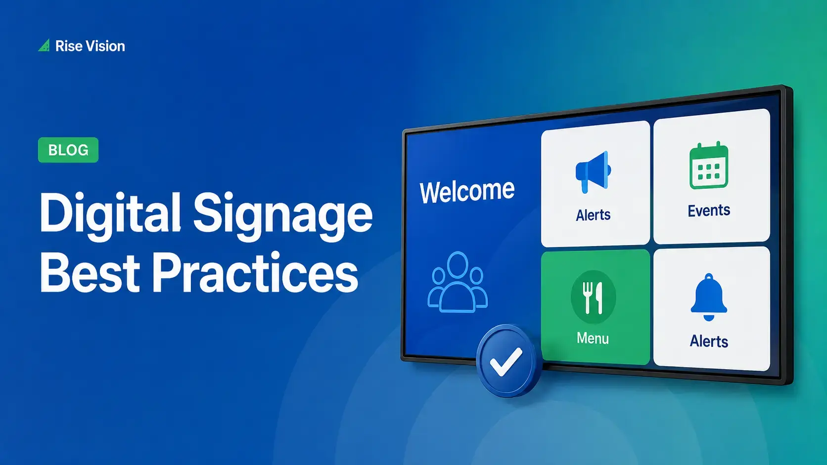
Digital Signage Best Practices for Schools and Organizations
Effective digital signage starts with legible design, accessible contrast, and content that matches your viewing environment. Keep screens current with a content plan, make updates simple enough for[…]
Read More -
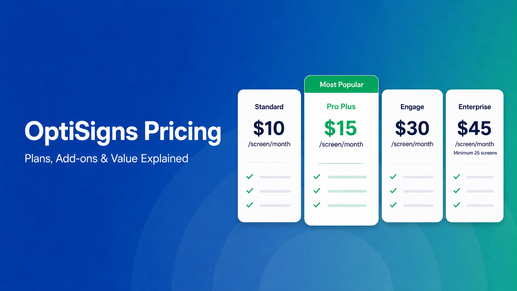
OptiSigns Pricing in 2026: Plans, Add-Ons, and What It Really Costs
OptiSigns' paid plans run $10–$45/screen/month ($9–$40.50 on annual billing). Add-ons for wireless presentation and video walls aren't included in any base plan, and phone support requires an upgrade[…]
Read More -
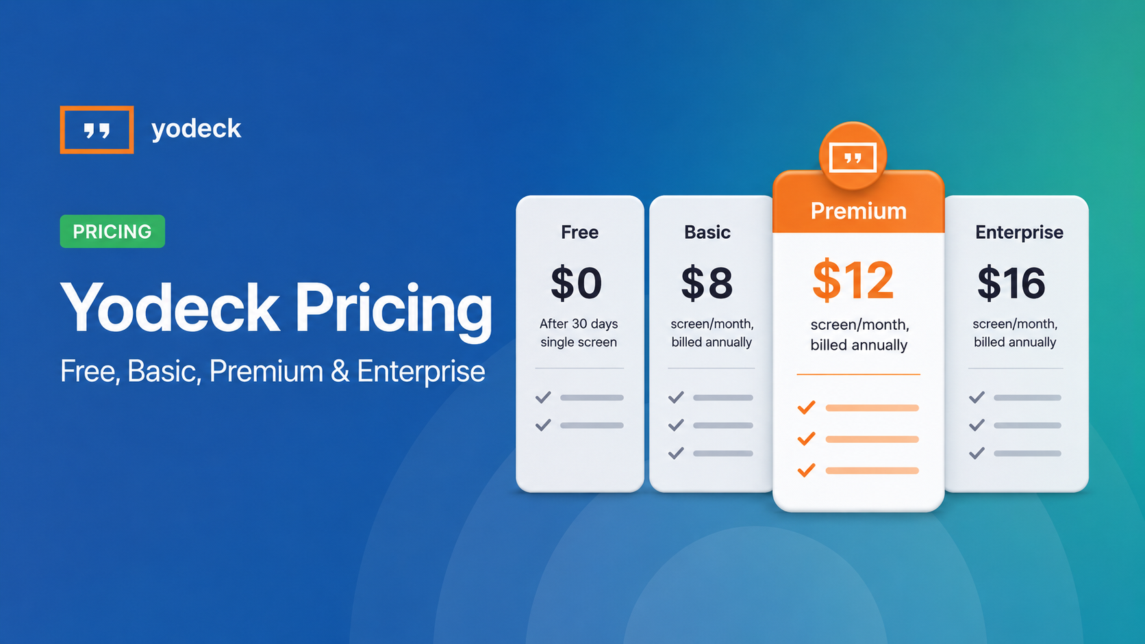
Yodeck Pricing: Plans, Costs & What Changed in 2026
Yodeck bills per-screen with no ceiling (free up to $16/screen/mo) so costs rise with every display added. 2026 Price Increase: Yodeck raised Premium and Enterprise plans by $1/month per screen,[…]
Read More
12,300+ Organizations Trust Rise Vision, You Can Too


Schedule a Free Demo
You deserve the #1 all-in-one platform for digital signage, screen sharing, and emergency alerts.


