
School information boards have been a primary way of communicating with student bodies for centuries. It’s easy to forget that at one point in time, schools didn’t have email, social media, digital signage display or even the ability to print out flyers. The information board - or bulletin board - has been central to campus communication since the 1800s (and probably a lot earlier than that).
However, the same problem applies now as it did then:
Is anyone reading this stuff?It’s easy to throw up any old news or informational item and assume students and staff will see it. The person in charge of creating the information board will completely understand what’s being communicated because it all came out of their head. The real question is: Does anyone else?
Over time, the evolution of information boards has reflected changes in technology and educational needs. The history of bulletin boards in schools shows how these displays have adapted to support learning, engagement, and communication.
What this article is really about is how school information boards can be designed to be effective and efficient at communicating to your entire campus. We’ll cover best practices, design tips, and considerations for both digital and traditional school information boards. You’ll also find school bulletin board ideas to inspire your next display.
Let’s begin!
What’s the Purpose?
It’s time to take a deep brain dive into why we have school information boards in the first place. This is a really important step because the more the information board goes out of scope or becomes information overload, the more ineffective the information board becomes. The last thing you want to do is make something that no one looks at, often ignore and effectively stops communicating information.
And so, as we dig into this, let’s outline one design rule to steer us through the entire process:
Less is more.While keeping this rule in mind write down the goal or purpose of your information board. An example could be:
- Present big and clear information regarding emergency situations
- Alert the campus body to important upcoming events (graduation, holidays, finals, etc.)
- Recognize students and faculty that have gone above and beyond for the school, community, or the world at large
- Highlight a specific subject or theme, such as science, history, or reading, to engage students with focused content
We recommend limiting the goal or purpose to a few items. Again, if the list starts to get too long, it’s possible the information board will lose its effectiveness. Focusing on a clear subject can enhance the impact and clarity of the information presented.
Data Time!
Before you start planning your information board content calendar, it’s always a good idea to get data on what’s worked in the past. How do you do this? Survey of course! Conducting research through surveys helps inform the design of the information board by identifying what content is most valuable.
Consider sending out a survey to the staff and ask them:
- What would you like to see on the information board(s) this year?
- What information has seemed to be lacking in the past?
- Has the information been clear and easy to understand?
- Has the information been displayed in a way that’s clear and easy to read?
- What has worked in the past?
You can also send out a survey to the student body. Now, depending on the age group, you may be thinking this will be a waste of time. But that isn’t a good reason not to do it. Negative responses, generally tend to be the most honest and are full of rich and detailed information. That being said, fourteen-year-olds might be the best population to get great insights from!
The responses you will receive will hopefully uncover a clearer direction on where to take your information board in the future. Collecting specific details from these responses can guide improvements and ensure your board meets the needs of your audience. And most importantly, set a reminder to conduct this survey annually or bi-annually. Being able to review past responses will help you see if your strategy and process is trending in the right direction.
If you’re looking for an easy way to send out a survey to your student body or staff, try using Survey Monkey or Google Forms.
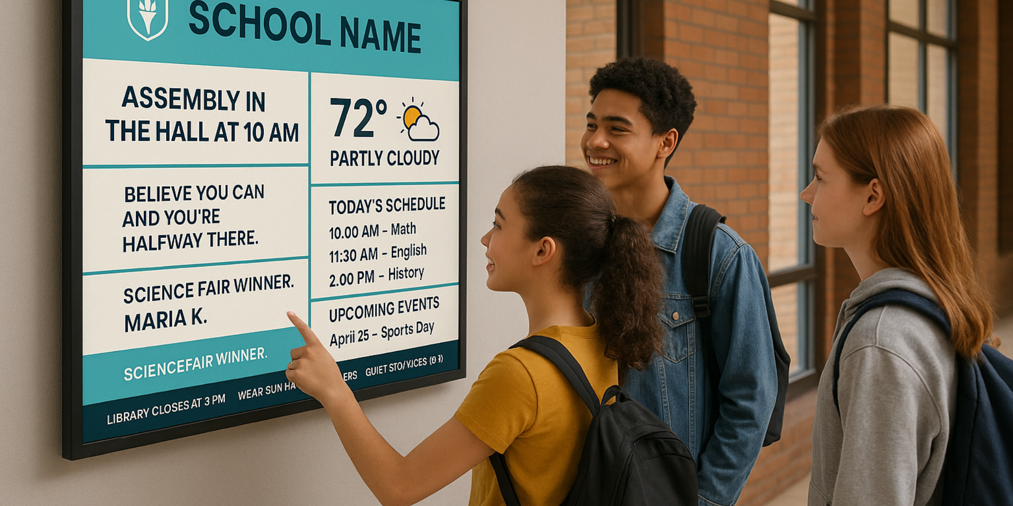
Information Board Design
Regardless if you’ve gone digital or you’re still using a corkboard with construction paper, the fundamentals of information board design are the same. Decorating your board with themed elements, borders, and visual aids can make it more engaging and visually appealing for everyone. The goal of your information board should be to communicate important messaging and/or information in a clear and concise manner that’s easy for the campus-body to digest. And the way that’s done is by using good design practices when creating your information board to ensure an effective bulletin board display.
Use A Large Font / Letter Size

You can see this sign a mile away thanks to the large type :) - Photo by Jacob Prose from Pexels
Your information board will be viewed from various distances. In order for it to communicate to the maximum number of people possible, you’ll have to increase your font or letter size to the largest size that works with your design.
One advantage of using free digital signage information boards is that letter size can be easily increased and adjusted. If you create your information board the traditional way, using markers and pens, making a mistake becomes very time consuming to correct.
Create A High Contrast Design

This staircase might be the safest in the world thanks to its extreme contrasting design. - Photo by Robin Schreiner from Pexels
High contrast designs help people see information more clearly. Additionally, certain people with disabilities require high contrast information. That’s why designing for disabled people to begin with tends to create a better design for everyone in the end.
One area that can be problematic is when certain color palettes are used. For instance, you may be using your school’s color palette for your text and background colors. There’s a chance that the contrast ratio between these colors isn’t great enough to satisfy the contrast requirement for people with disabilities. You may have to opt for white and black for most of your textual information. To check your contrast ratio use this site.
Cut Out The Clutter

We know, it’s tempting to add one more thing..but it’s just bad design. Image Source.
Clutter prohibits effective communication by adding too much visual and informational noise to your message. The more the viewer’s eyes bounce around the information board, a cluttered design becomes more of a distraction to information consumption. Remember, less is more.
Information board design is an iterative process. It’s O.K. to start with a lot of information, a particular layout in mind and a guess at letter sizing. You may have to rework your board a few times to get it right. This is how most great things are made! Again, digital information boards make this process a lot easier.
Avoid Swiping Slides and Changing Screens for a More Interactive Experience

You definitely don’t want less important information interfering with an emergency situation message.
This specifically applies to digital information boards. Boards that continually change every few seconds may seem like an advantage: you can fit more information on your boards by having a near infinite amount of slides at your disposal. However, if you really want information to stick, it’s wise to use one screen during your messaging cycle.
If you can do it, try to focus on one main informational message a week. More students and staff members will likely retain the message.
Placement
The placement and location of your school’s information board is a critical factor to its effectiveness.
Long hallways may seem like a great place to put an information board. However, if students and staff tend to walk briskly by without looking at the information board, it might be a poor location for it. Study behavior around hallway areas and take notice of whether or not people look at the walls or if they only look straight ahead.

The hallways may be better suited for murals depicting school pride as shown in the photo above. Image Source
A better location for your information board may be in places where people tend to congregate and where they’re not walking from one location to another. Consider placing your information board at the end of a hallway where people walk towards it and not alongside it. This can bring more attention and engagement to the board. A well-placed board can also create a warm and inviting atmosphere for everyone who passes by. Seeing the board in a central location can spark joy among students and staff, making the space feel more positive and welcoming. This can increase the time they have to capture information as they approach the information board.
Good Examples of Traditional School Information Boards
Let’s go over a few real-life examples of schools that have done a great job at executing traditional cork information boards. Using a bulletin board set can help create a cohesive and visually appealing display. When decorating your board, consider selecting the right product to match your classroom theme and needs. Decorating is an important part of setting up these examples, as it enhances the overall learning environment.
The Perfectly Organized & Laid Out Parent Board

This information board has a well-organized layout, good contrast, clear typography and isn’t cluttered. It also engages parents to grab a clipboard to dig into more information. Consider including a section where families can share family recipes, traditions, or accomplishments, encouraging family participation and fostering a sense of community.
The Growth Mindset Information Board

The above bulletin board is a good example of clear lettering and large text. Not to mention, the Growth Mindset theme has tremendous value to students and staff. This board also helps build confidence in students by encouraging them to embrace challenges and believe in their ability to improve. Finally, we can see that this bulletin board isn’t cluttered.
The Textured Positive Message Board

This is a great example of how to keep a themed message crystal clear and easy to digest. For instance, this bulletin board idea could be used during spring for several weeks. Students love engaging with this type of board, especially when it includes interactive elements. It’s a simple message with a highly textured feel that makes the message stick and remain memorable. This example could also be adapted as an interactive bulletin board to increase participation and hands-on learning.
Good Examples of Digital School Information Boards
Emergency Warning

Get started with this template here.
One of the best things about digital information board systems is that they can be updated quickly to get important, even life-saving, information out to the campus body.
The digital information board above is high-contrast and the message is succinct. Exactly what you need in an emergency situation.
Upcoming Exam

Get started with this template here.
Many schools will put up tons of information about all sorts of events, positive messaging and other things in one huge cluttered information board. There will be so much information, that very little information is transferred because of the high level of noise. Sometimes, it’s best to focus on one key event and subtract everything else.
Consider having a dedicated section where students write important exam dates or reminders. Also, leave some space on the board for last-minute updates or changes to ensure everyone stays informed.
Upcoming SAT and ACT Dates

Get started with this template here.
Similar to the Upcoming Exam information boards, letting students know of the most important college-required tests is another good idea. Some students won’t know that there are multiple dates to take the test and other key information. Displaying important test numbers, such as exam dates or score requirements, can help students stay informed and prepared. Don’t let them fall victim to hearsay - put the facts up on the wall!
What Schools Are Saying About Digital Information Boards
You know, it's one thing for us to talk about how great digital information boards can be, but honestly, hearing from schools that actually use them day in and day out? That's where the real story is. Here are a few schools that made the switch and haven't looked back.
Chet Neal from RelianceAV set up 16 displays for Mount Vernon Middle School, and here's what he had to say: "The school uses it extensively to convey school events and positive messaging to students. Content management is intuitive, and Rise Vision's continuous development of templates keeps content fresh and engaging." What stands out here is how they're using it for exactly what we've been talking about - school events and positive messaging. And the fact that templates keep getting updated? That's kind of a big deal when you're trying to keep things fresh without starting from scratch every week.
Gary Lambert, an IT Administrator at a K-12 District, shared his experience too: "Rise Vision exceeded my expectations. The templates are professional, the centralized management saves time, and the support is outstanding." Coming from an IT perspective, this matters because he's the one who has to actually keep things running smoothly across multiple schools. The centralized management piece means he's not running around to every building just to update a single message.
Matthew Mason from a school district put it pretty bluntly: "Rise Vision is a game-changer for our communications. It saves us time and eliminates the need for printed posters." And there it is - that shift from spending hours cutting out letters and laminating paper to just updating content digitally. His school went from dealing with printed posters (which get outdated, fade, or fall off the wall) to managing everything from a laptop. That's the kind of practical benefit that makes digital boards worth considering.
How to Create a Digital Information Board
You’ll need two hardware items in order to create a digital information board. They are:
- A TV with an HDMI port
- A media player
Your school may already have TVs around campus. Perhaps they’re used for slideshows and keynote presentations. Ask your IT department if one can be used for a digital information board or if a new one can be ordered.
All digital information boards require a media player to operate the information board software. There are numerous media players on the market as of today, we recommend the Rise Vision Media Player or Avocor R Series. If you need help choosing the right media player, then you will find this article to be helpful.
The next step is to install the information board software on your media player. You can sign up for a free Rise Vision account here and get started with our software. If you have any questions about anything related to getting started, always feel free to reach out to our support team.
Once you’re set up, simply choose one of our templates from our templates gallery. You’ll find these templates are easy to use and the amount of time spent updating your information board will be a fraction of what it used to be. Many templates include interactive content such as coloring pages, which can be used for engaging classroom activities and displays.
Digital boards can also feature activities about habitats and shapes, supporting science and math learning. These boards help students learn new concepts and vocabulary through engaging and interactive displays.
All our templates are optimized for digital signage use and adhere to the best practices mentioned above.
Budgeting for Your Information Board
You know, setting a budget for your school's information board is honestly one of those key steps that can really make or break how your display turns out throughout the year. When you plan ahead like this, you're basically ensuring your board doesn't just look inviting but actually supports student learning no matter what season you're dealing with. It's smart to allocate funds for those essential supplies—think bulletin board borders, colorful letters, and themed decorations that you can swap out for spring, holidays, or whatever special events pop up. Don't forget you'll need materials that help you update the board regularly too; keeping information current and engaging isn't just nice to have, it's kind of essential. A well-planned budget really allows you to set the stage for a creative and informative display, making it way easier to introduce new topics, celebrate achievements, and inspire students every time they walk by. With the right resources in place, your information board can actually become a central hub for learning and school spirit that works all year long.
Community Involvement
You know, bringing the school community together is honestly one of the best ways to make your information board really shine. Get students involved by encouraging them to share their wins, jump into activities, and even help design parts of the board. Invite parents and staff to pitch in with ideas, photos, or messages that celebrate the people and events that make your school stand out. You can set up a dedicated Instagram account to share updates, behind-the-scenes glimpses, and inspiration from the board—it's kind of like having a digital window that keeps everyone connected and involved. By making the board a team effort, you're fostering real pride and ownership, turning it into this living display that actually captures what your school's all about. Community involvement doesn't just keep the info fresh and on-point—it honestly inspires students to step up and share their own stories too.
Content Rotation Strategies
You know, keeping your information board fresh and exciting isn't just about slapping up new content whenever you feel like it—it really takes some thoughtful planning for regular rotation. Honestly, developing a schedule that lines up with the school year is kind of a game-changer, and you'll want to highlight different subjects, activities, and themes each month. I mean, think about it—you could feature math challenges in September, reading goals in October, or maybe science facts when spring rolls around, right? Rotating content like this ensures that students always have something new to check out and learn from, which honestly sparks their curiosity and gets them coming back to the board more often. You'll want to share inspiration and info that ties into classroom learning, school events, or even what's happening in the world right now—it makes the board feel like a dynamic resource that both students and staff actually want to use. By planning ahead and switching up topics, you're helping keep the board relevant, engaging, and honestly, a valuable tool for learning and sharing that works throughout the year.
Maintenance and Updates
You know, a really great information board is one that's always looking fresh and, honestly, up-to-date with what's actually happening. Think about it—when's the last time you walked past a board with old, yellowed papers still hanging there? Kind of defeats the purpose, right? What you really want to do is set aside some time each week to give that board a good look-over for any outdated stuff, worn-out materials, or anything that just needs... well, a little refresh. Here's where it gets interesting—get your students involved in the whole process! Have them help out with updating those calendars, swapping out bulletin board borders, or adding new achievements and activities they're actually excited about. This kind of regular maintenance doesn't just keep the board looking good (though that's important too), but it honestly ensures it stays this source of inspiration and pride that the whole school community can feel connected to. When you stay on top of those updates, you're highlighting recent student achievements, showcasing what's coming up that everyone should know about, and really keeping everyone in the loop. A well-maintained board? It's actually a pretty great way to celebrate your school community and help students feel connected and motivated every single day.
Feedback Mechanism
You know, if you really want your information board to hit the mark, you've got to tune into the folks who actually use it day in and day out. Here's the thing—setting up a solid feedback system where students, parents, and staff can throw in their two cents, ask questions, or pitch ideas is honestly a game-changer. It doesn't have to be fancy either; we're talking maybe a simple suggestion box sitting right nearby, an online form that's easy to find, or even those interactive cards pinned straight onto the board where people can jot down whatever's on their mind. And here's where it gets interesting—actually displaying some of that feedback right on the board itself? That makes things feel alive and shows everyone that their voice really does matter. When you encourage this kind of back-and-forth, you're basically ensuring the board stays on point for your school community, keeps things fresh and relevant, and continues to inspire and inform people in ways that actually work. The real magic happens when you regularly check in on those suggestions and actually do something with them—that's how your board grows, improves, and becomes this genuinely collaborative resource that everyone finds helpful.
More From Our Blog
-
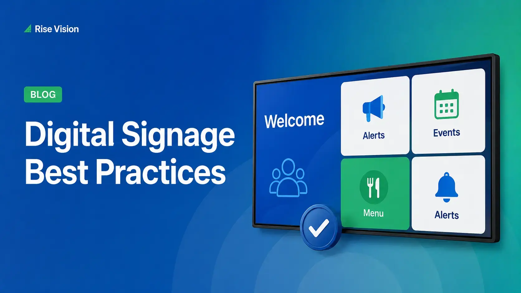
Digital Signage Best Practices for Schools and Organizations
Effective digital signage starts with legible design, accessible contrast, and content that matches your viewing environment. Keep screens current with a content plan, make updates simple enough for[…]
Read More -
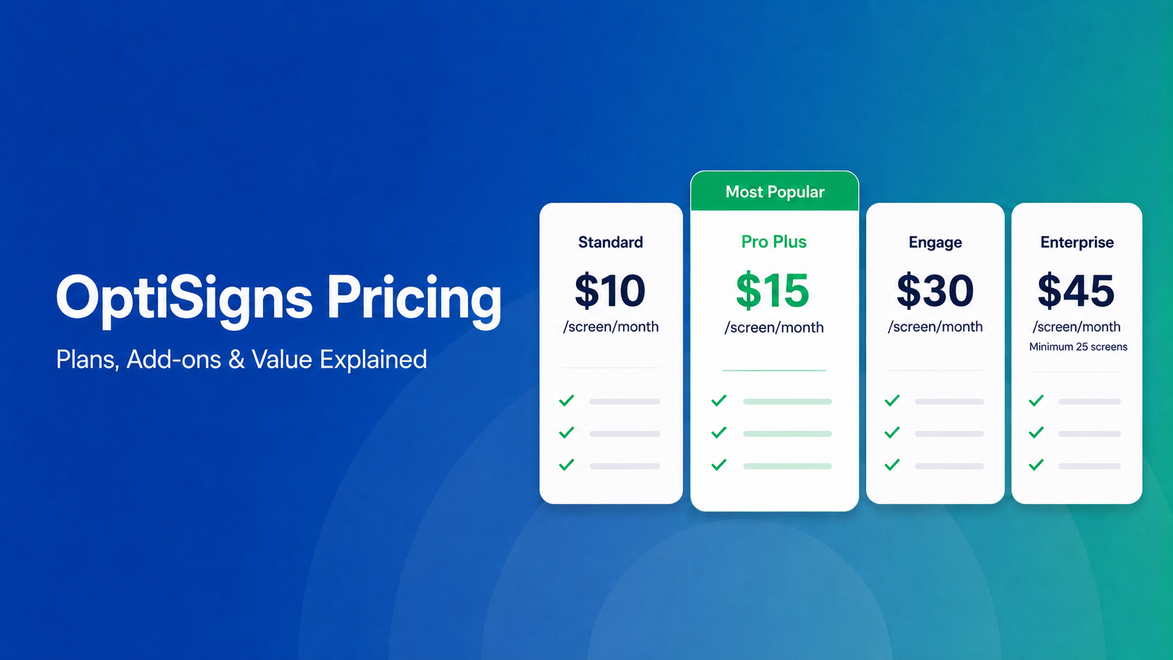
OptiSigns Pricing in 2026: Plans, Add-Ons, and What It Really Costs
OptiSigns' paid plans run $10–$45/screen/month ($9–$40.50 on annual billing). Add-ons for wireless presentation and video walls aren't included in any base plan, and phone support requires an upgrade[…]
Read More -
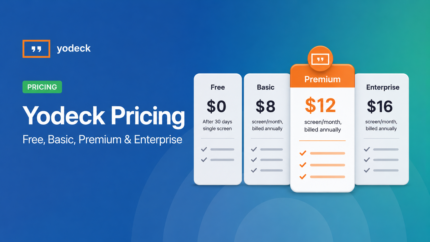
Yodeck Pricing: Plans, Costs & What Changed in 2026
Yodeck bills per-screen with no ceiling (free up to $16/screen/mo) so costs rise with every display added. 2026 Price Increase: Yodeck raised Premium and Enterprise plans by $1/month per screen,[…]
Read More
12,300+ Organizations Trust Rise Vision, You Can Too


Schedule a Free Demo
You deserve the #1 all-in-one platform for digital signage, screen sharing, and emergency alerts.


