
Written by Nikta Kanuka
Digital Signage Dashboard Design
Dashboards are increasingly becoming an indispensable business acceleration tool, and for good reason too! Dashboards can help streamline day-to-day operations and unite your team around common targets.

At Klipfolio, we have different dashboards up on the wall for different teams (after all, we live and breathe dashboards here all day!). In this post, I’ll show you how dashboards can improve your business, and share some tips on designing an effective dashboard to have up on the wall.

What are dashboards?
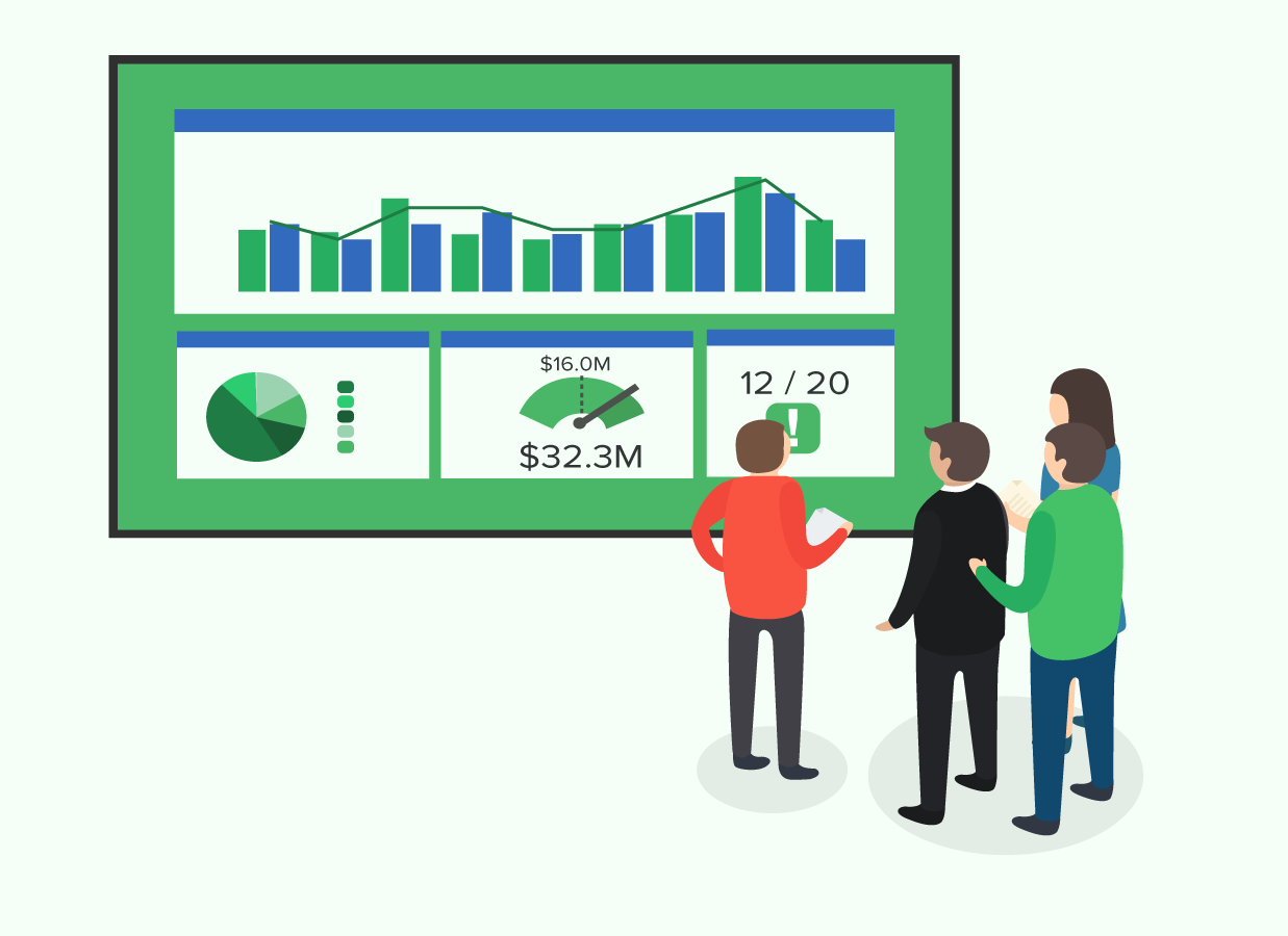
So, what is a business dashboard anyway? Dashboards can help answer your burning business questions with the most up-to-date data.
You can use them to track KPIs, metrics, and other key data points relevant to a business, department, or specific process. Through the use of data visualizations, dashboards simplify complex data sets to provide users with at a glance awareness of current performance.
How do organizations use dashboards today?
Imagine knowing how much advertising budget you have left at any given moment. Or how many support tickets have yet to get a response. Or how close you are to reaching your fundraising goal.
Now imagine getting the answers to these questions by simply looking up at a dashboard on your office wall.
At Klipfolio, we have multiple dashboards around the office. On our marketing dashboard, we have stats on the number of new trials compared to our targets, as well as web traffic metrics.
Our support team has a dashboard to help decrease the average response time to tickets, and to keep track of the volume of tickets over time (in case we need to hire more support staff!).
Our sales dashboard shows metrics on the number of sales today, and how close we are to our monthly and quarterly targets.
But those are just a few ways we use dashboard. Check out how Boston Public Schools and The Hunger Project (a global, not-for-profit) use dashboards to create a more data-driven culture:

Boston Public Schools uses this dashboard to monitor network performance across schools, and to get ahead of communications when the network is down. Marc Racine, Chief Information Officer says that his dashboards “are changing staff behavior, helping us get in front of network challenges from an external communications perspective, and enhancing internal communication across departments.”

The Hunger Project uses this dashboard to communicate to investors and stakeholders. As Megan Colnar, The Hunger Project’s Director of Monitoring and Evaluation puts it “Today’s donors want to know what needs to be done and what is currently being done. Our new dashboard helps us tell a story in a way that is easily understood.”
Okay you’ve convinced me, but how do I start?
Creating a dashboard that is relevant and actionable requires some planning and design. Here are four tips for building well-designed, actionable dashboards:
1. Build for a specific user
One of the biggest mistakes that we see with new dashboard builders is the desire to cram everything into one dashboard. While this one-size-fits-all approach seems exciting at first (look at all these KPIs!) it results in a one-size-fits-nobody dashboard that quickly loses purpose.
Instead, design for a specific role in your company. Interview people in that role to understand what metrics they have control over. For example, a digital marketing manager is obsessed with understanding the return on marketing investment. As such they will be laser focused on marketing metrics like digital ad spend and cost-per-lead.
2. Give the data context
How many leads is a good number of leads? How long is too long for a customer to wait for a response from support? Some metrics may have targets, others a certain threshold they should not cross, and still others are best understood in a historical context.
Just compare the Klips below:


The first one gives no indication of whether 97 leads is good or bad. The second shows that it’s much better than yesterday (410%!) the last shows how it compares to yesterday, and how close it is to the target.
Aim to give each metric on your dashboard the context that it needs to be actionable for the viewer.
3. Think about the reaction
I’ve mentioned actionability several times throughout this post and that’s because it’s one of the key ingredients to a successful dashboard.
For each performance metric, ask the person you are designing the dashboard for what the possible reactions might be. Reactions can take many different forms:
- Asking more probing questions
- “Why are we getting so few clicks on our latest Facebook Ad?”
- Scheduling a meeting to discuss tactics
- “We haven’t been meeting our sales targets for 3-days in a row now. Can we offer a discount to close the gap?
- Changing something
- “Let’s redirect budget from Instagram Ads to Facebook Ads, because the ones on Facebook are performing much better.”
If the metrics on your dashboard aren’t actionable, or don’t change from day-to-day, they’ll become background noise rather than a business acceleration tool.
4. Don’t make ‘em think
Finally: keep things simple! For a truly effective dashboard, stick to just a handful of metrics, each of which is easily visible (use legible fonts), actionable, and has context. Avoid using visualizations that require thinking to interpret (scatter-pie-plots anyone?) and only use color if it truly conveys additional meaning.
5. Start and end with good design
Remember, this is a dashboard that will live on the wall (using Rise Vision technology of course!). It’ll be the first thing your team sees when they come in in the morning, and the last thing they see when they leave the office. That’s why it’s important to get feedback from your dashboard audience every step of the way—from napkin drawing inception, to frequent check-ins—to ensure that it’s still relevant long after it’s first created.
Want more digital signage design resources? Check out the links below!
- 101 Digital Signage Content Ideas
- How to Use Color Theory in Digital Signage Design
- Golden Ratio for Digital Signage Design